The LA28 typography is made of 4 custom fonts
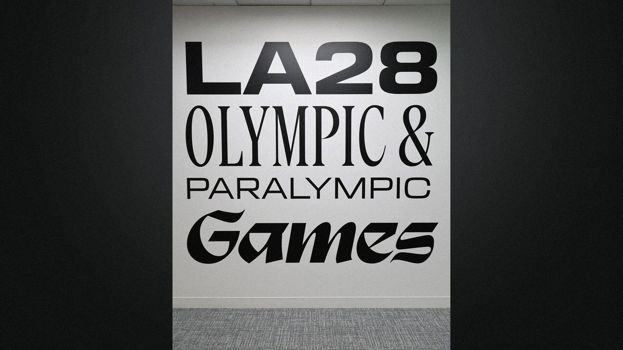
The last time Los Angeles hosted the Olympic Games, designers had a relatively simple typographic system. It used the italic sans-serif Univers 66 as its logotype along with a blocky stencil-style “LA84” mark that appeared on venue and urban signage. More than 40 years later, the 2028 Los Angeles Games will use an entire bespoke four-font book.
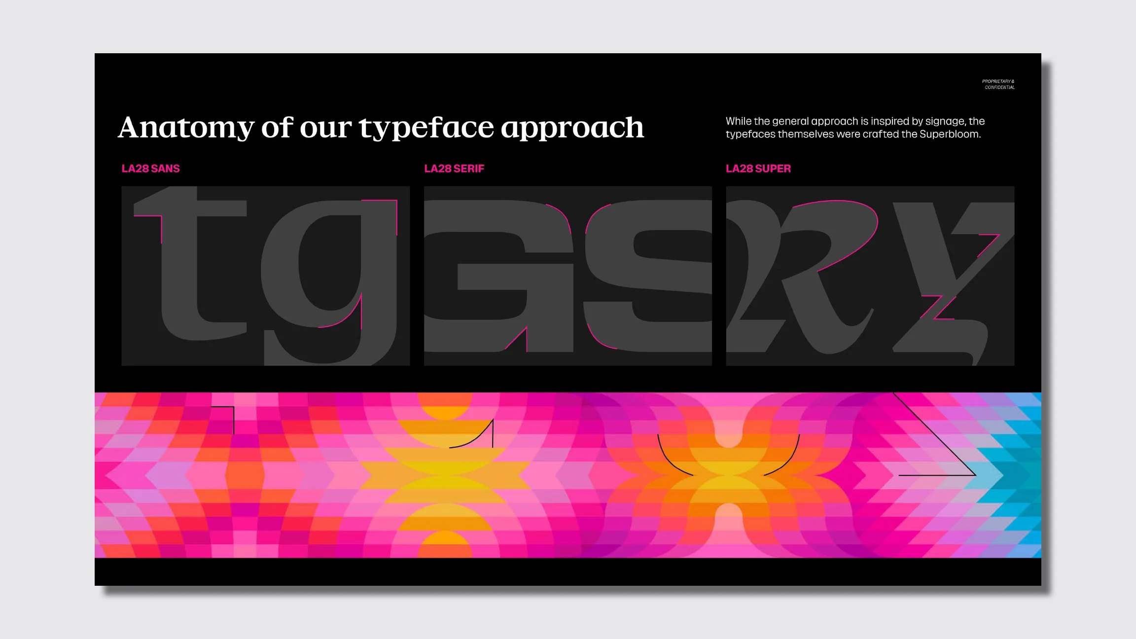
The typeface of the 2028 Games brand and design system developed by Koto Studios is called LA28, and it’s inspired by strip mall signage and hand-painted street lettering across L.A. The typeface comes in four distinct styles, Display, Sans, Serif, and Super, and together they represent a much more eclectic approach to typography than we’re used to seeing from Olympics-related design.
“Each one has a distinct personality and purpose within the system,” Geoff Engelhardt, head of brand design for LA28, tells Fast Company. The goal with the fonts is to capture the feeling of Los Angeles rather than produce a literal depiction of it, he says. “We wanted the typography to feel like it could only belong to Los Angeles.”
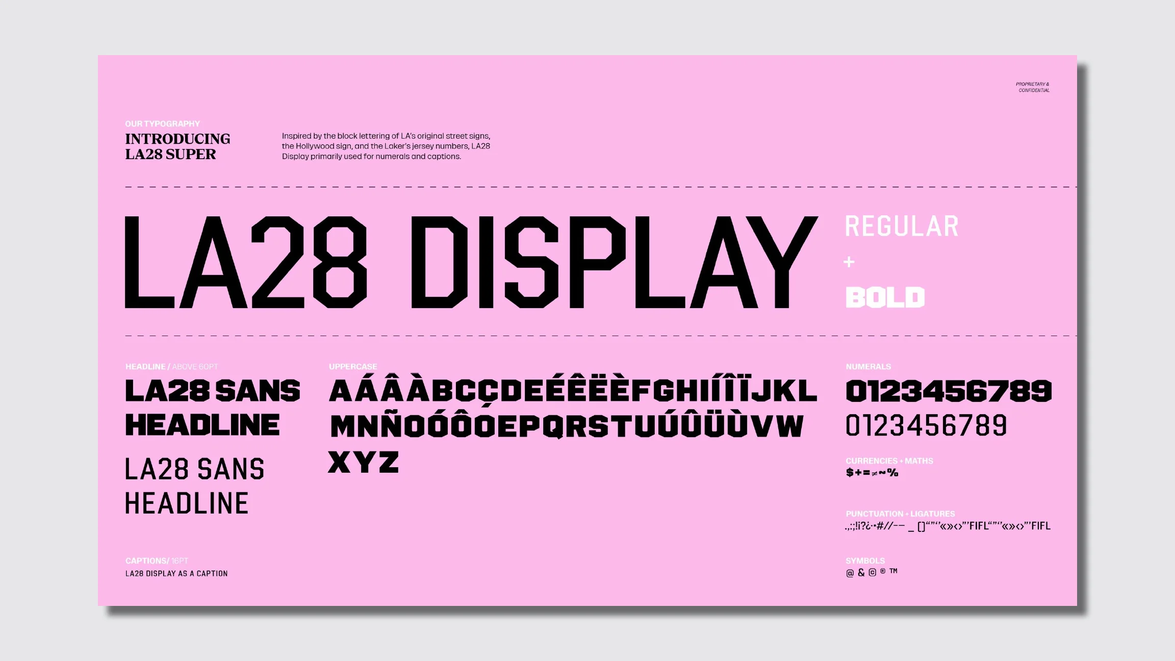
LA28 Display is inspired by the block lettering of L.A.’s original city street signs, and it’s meant for things like numerals, captions, and wayfinding.
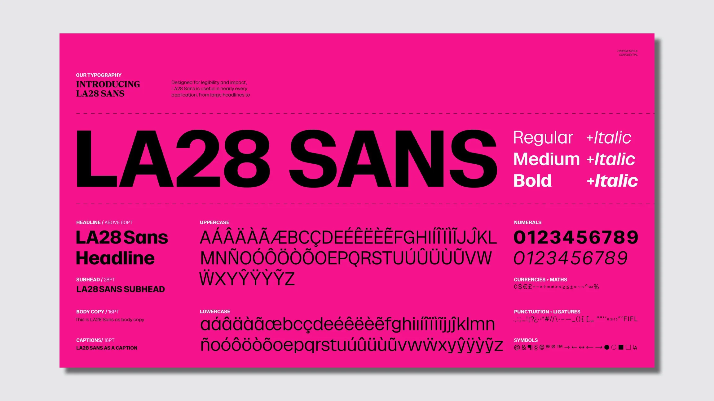
LA28 Sans is designed for clarity, legibility, and accessibility for text-heavy use cases.
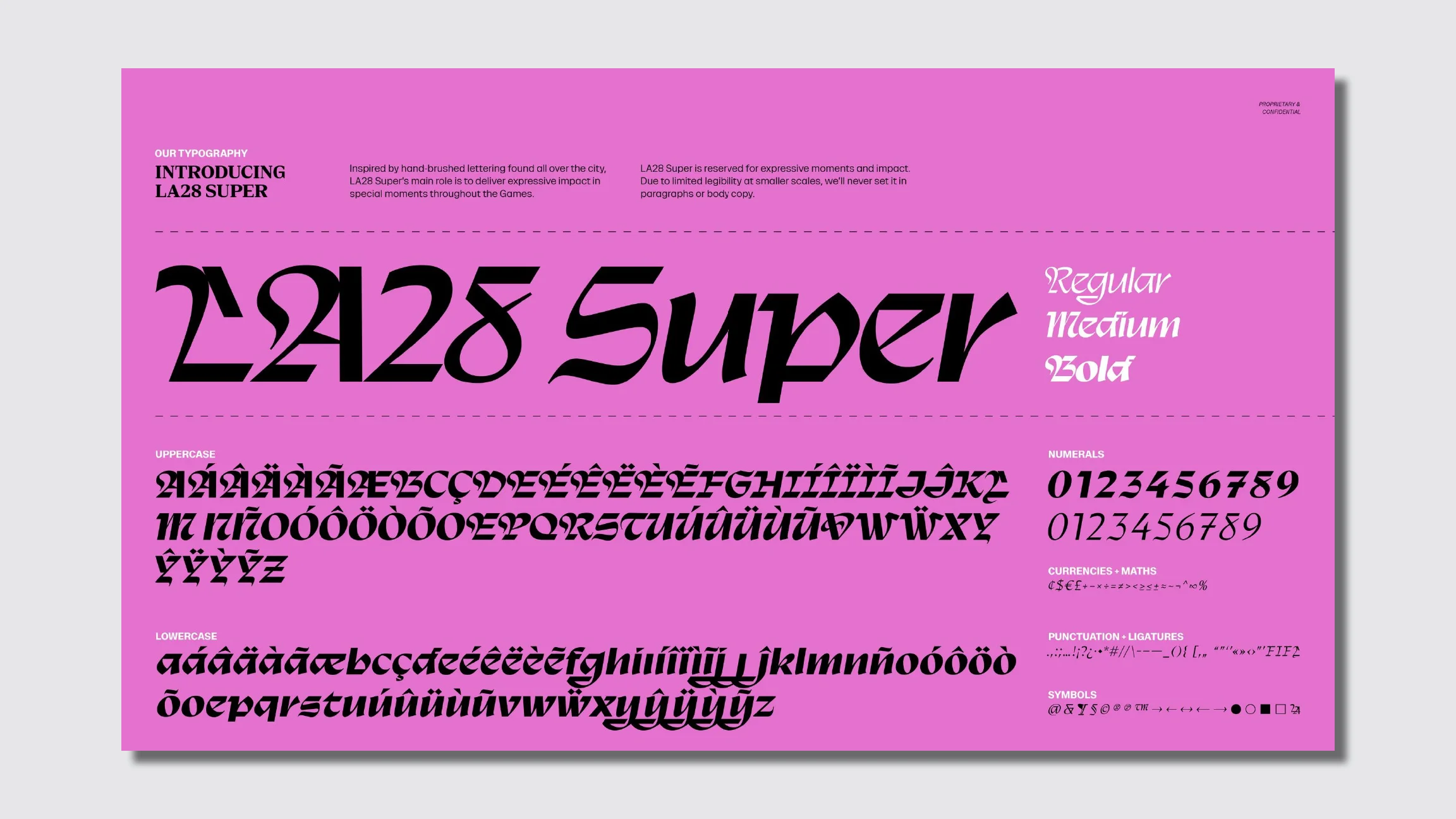
Then there’s LA28 Super, which is just the opposite. A charismatic, stylized, calligraphy-style font, Super is reserved for expressive moments and large-scale impact, as in graphic collateral that previews the brand, showing a billboard that reads “Bienvenidos” (“Welcome” in Spanish). Its letterforms mix sharp angles and shapes with smooth curves and distinctive flairs.
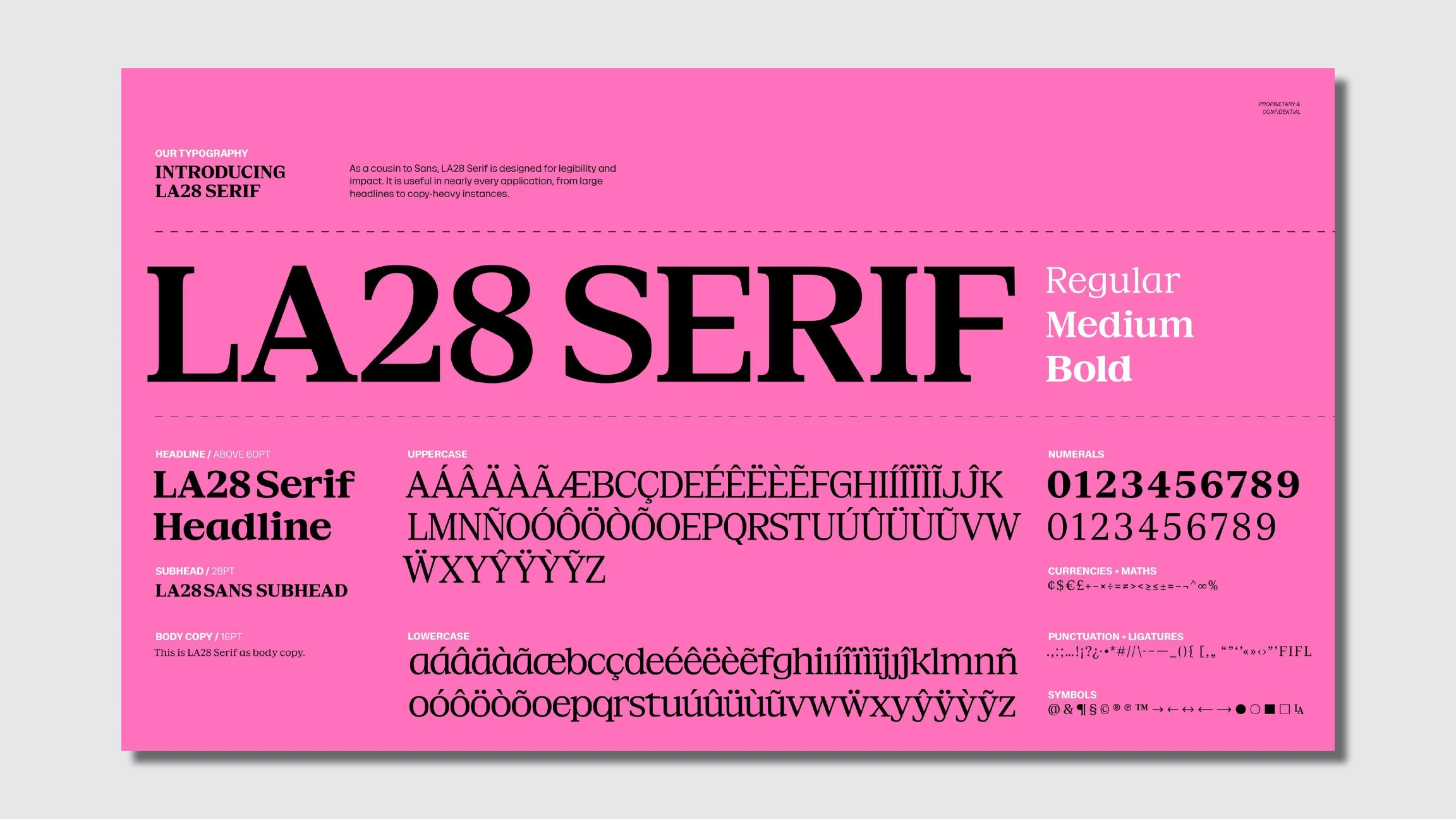
LA28 Serif is a counterpart to Sans, a serif workhouse font for heavy copy. Both are ADA compliant, meaning they meet the accessibility requirements of the Americans With Disabilities Act.
Together the fonts create a typographic system that’s more complicated than we’ve seen for Games of decades past. But it fits the wider approach organizers have employed to form the visual identity of LA28, taking inspiration from the diversity of the city.
“There’s a whole visual culture living on the streets of Los Angeles, in the storefronts, the hand-lettered murals, the block lettering on original street signs, and we wanted to honor that rather than import something that felt foreign to the city,” says Ric Edwards, VP of brand design and executive design director for LA28.
The 1984 Los Angeles Olympics used a vibrant color palette expressed through assets like a recurring confetti pattern and venue staging. The broader look and color palette of the 2028 Games is an updated homage called Superbloom, drawn from Southern California flora and the city’s official flower, the Bird of Paradise. That same sense of expressiveness is being brought to the 2028 Games customizable logo, which replaces the A in LA28 with other graphics, and in the multi-font typography.
Past Olympics often branded themselves in a universal style built on grids; a unified, cohesive visual language; and sans-serif typefaces like Helvetica. That style was singular and could be ported over to the visual brand or logos of any other Games anywhere. Designers for forthcoming Olympics are taking a more experimental route.
While the 2002 Salt Lake City Games used the sans-serif Frutiger as its type family, the 2034 Utah Games released a logo with a distinctive typeface that built its letterform from natural shapes and Utah topography. In California, it’s about typography that’s capable of representing a city as dynamic and diverse as Los Angeles.
“It’s asking us to embrace the idea of variety as utopia,” says Charles Nix, senior executive creative director at Monotype.
“We’re living in a time of incredible typographic plenty. There’s so much variety typographically now that it’s never been like this in the history of typography,” he says. “It seems almost rational in a way that people would embrace that typographic variety and want to express it.”
To apply a four-font brand in a unified way, the LA28 type family is designed with a clear hierarchy. Each font has a distinct personality and purpose within the system. Organizers say they think of it less like a style guide and more like a musical composition, with the fonts as visual frequencies that can be mixed and layered but are always in harmony.