Why Papa Johns needed more than just a new logo
Papa Johns is hoping to bring some new life to its brand. In 2021, the pizza chain rolled out a rebrand following a racist statement made by its founder. Three years on, the company is looking to build out the rest of its new visual language.[Image: Papa Johns]The rebrand “gave a little bit of a facelift to the brand,” says Jaclyn Ruelle, Papa Johns vice president head of brand. Though the new logo happened before she joined the company, Ruelle says the decision to drop the apostrophe from the company’s name showed that it “no longer held a single ownership.” Now with their “Better Get You Some” campaign, they’re hoping to build out a more developed vision for the brand, and reach a younger demographic in the process.[Image: Papa Johns]“We kind of lost some of that emotional attachment with our customers, and so that brand love and loyalty was suffering,” Ruelle says.The Martin Agency led the “Better Get You Some” campaign, which builds on Papa Johns’ longtime slogan “Better Ingredients, Better Pizza.” The call-to-action comes in a gooey, custom font called Pappy that does more to evoke the shape of pizza dough than any sans serif could.[Image: Papa Johns]“The rounded corners, and the slight forward-leaning nature of each character were inspired by the form of a piece of dough as it flies up in the air,” says Robyn Makinson, design director at the Martin Agency. “The splash of the red sauce as it lands on the dough is reflected in the smooth wide curves of each letter.”[Image: Papa Johns]The agency also built out a color palette based on the pizza chain’s ingredients, like a shade of green in the brand’s color palette inspired by the pepperoncini included in its pizza boxes.[Image: Papa Johns]The quick-service pizza category “is a constant race to the bottom” with brands trying to out-coupon each other, says Ruelle. “There’s a lot of price wars that tend to go on.” The chain hopes the new campaign, which includes an MTV bumper-style video with an original song by Big Boi, drives new customers and builds stronger loyalty with its existing customers.“To become an iconic brand, design must be at the center,” Makinson says.
Papa Johns is hoping to bring some new life to its brand. In 2021, the pizza chain rolled out a rebrand following a racist statement made by its founder. Three years on, the company is looking to build out the rest of its new visual language.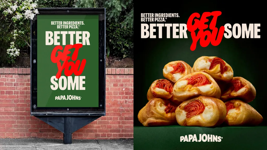
The rebrand “gave a little bit of a facelift to the brand,” says Jaclyn Ruelle, Papa Johns vice president head of brand. Though the new logo happened before she joined the company, Ruelle says the decision to drop the apostrophe from the company’s name showed that it “no longer held a single ownership.” Now with their “Better Get You Some” campaign, they’re hoping to build out a more developed vision for the brand, and reach a younger demographic in the process.
“We kind of lost some of that emotional attachment with our customers, and so that brand love and loyalty was suffering,” Ruelle says.
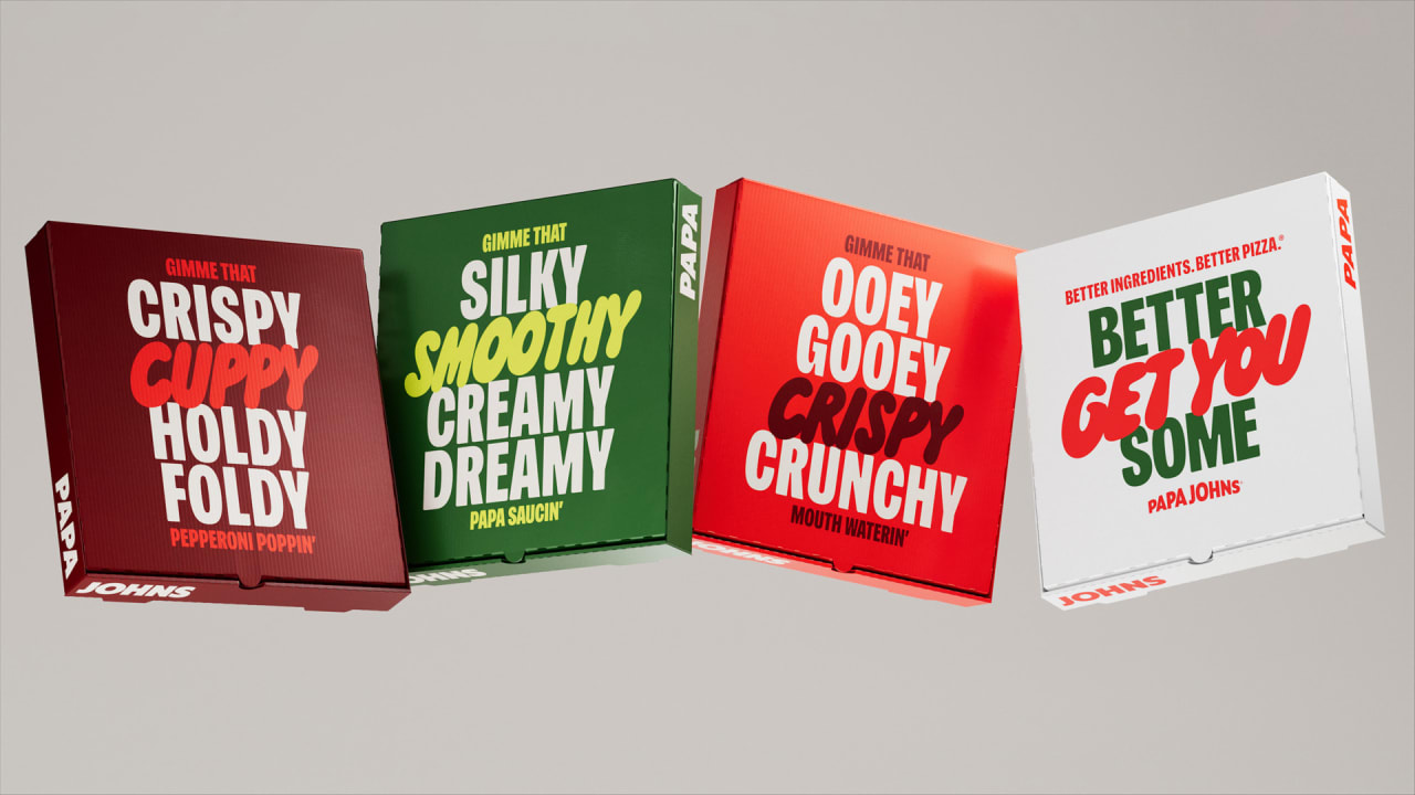
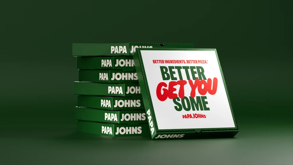
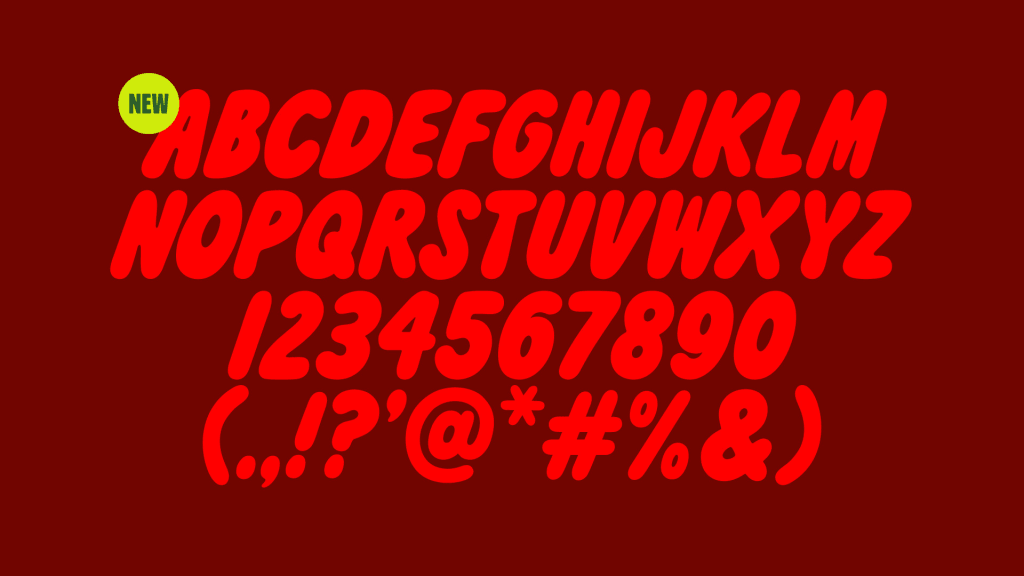
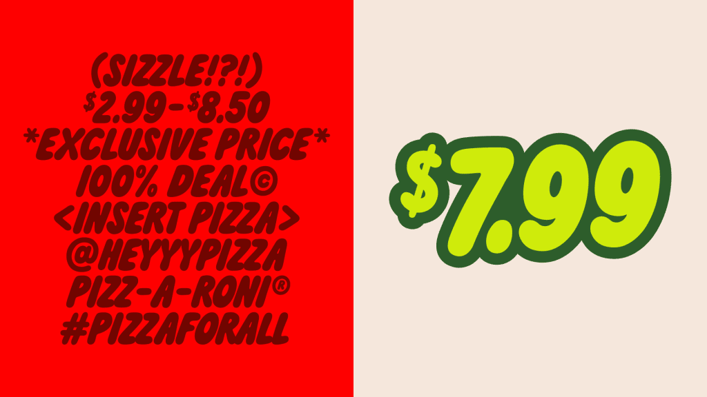
The Martin Agency led the “Better Get You Some” campaign, which builds on Papa Johns’ longtime slogan “Better Ingredients, Better Pizza.” The call-to-action comes in a gooey, custom font called Pappy that does more to evoke the shape of pizza dough than any sans serif could.
“The rounded corners, and the slight forward-leaning nature of each character were inspired by the form of a piece of dough as it flies up in the air,” says Robyn Makinson, design director at the Martin Agency. “The splash of the red sauce as it lands on the dough is reflected in the smooth wide curves of each letter.”
The agency also built out a color palette based on the pizza chain’s ingredients, like a shade of green in the brand’s color palette inspired by the pepperoncini included in its pizza boxes.
The quick-service pizza category “is a constant race to the bottom” with brands trying to out-coupon each other, says Ruelle. “There’s a lot of price wars that tend to go on.” The chain hopes the new campaign, which includes an MTV bumper-style video with an original song by Big Boi, drives new customers and builds stronger loyalty with its existing customers.
“To become an iconic brand, design must be at the center,” Makinson says.

