We’re so close to the perfect foldable phone
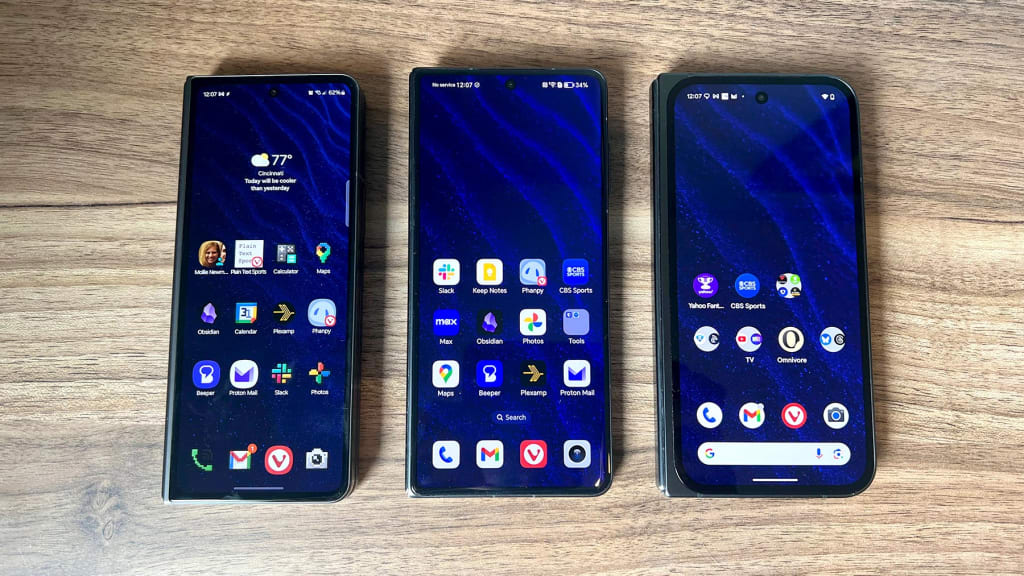
Here is what I want in a foldable phone: The design of Honor’s Magic V3. The multitasking features of Samsung’s Z Fold series. The camera system and software of Google’s Pixel 9 Pro Fold. Large-format foldable phones—those that unfurl into something like a small tablet—are great for watching videos, reading, and playing games. They also excel at productivity by letting you view two regular-sized apps at the same time, and they’re easier to type on with your thumbs. But even as a foldable phone fan, I’ll admit that every current option has some kind of glaring compromise. While the pieces for a perfect foldable phone are all there, we just need one phone that puts them all together. Samsung Galaxy Z Fold5, Honor Magic V3, Pixel 9 Pro Fold. [Photo: Jared Newman] What the Pixel 9 Pro Fold gets right My impetus for thinking about all this is the Pixel 9 Pro Fold, Google’s second attempt at a foldable phone. Having bought a Samsung Fold5 last fall, I was eager to see how a foldable Pixel would compare. For the most part, I’ve enjoyed my time with Pixel 9 Pro Fold: It’s slimmer than Samsung’s book-style foldables, and there’s a satisfying springiness when the phone folds open and shut. Google’s Pixel software also still represents Android at its best. Google’s default apps have some smart features, such as call screening in the Phone app and the “Bedtime” mode in the Clock app, and the Material You design language just looks sharper to me than Samsung’s software aesthetics. In many ways, Pixel phones are simpler to use than a iPhone, and that’s true of the Pixel 9 Pro Fold. What I’ve appreciated most is the camera system. While the Pixel 9 Pro Fold uses smaller sensors than the rest of the Pixel 9 series, the cameras still have the can’t-miss quality that’s long been a hallmark of Google’s phones. I’m willing to trade some low-light detail for knowing that if I snap a hurried photo of my kids while they’re playing, it’s not going to get messed up by motion blur or a laggy shutter. The Pixel 9 Pro Fold’s 5X telephoto lens also comes in handy, as does the “Made You Look” feature that shows goofy animations on the outer screen to attract kids’ attention. What’s not to like? But as I used the Pixel 9 Pro Fold, I started missing a bunch of things about Samsung’s Z Fold series. Samsung’s foldable, for instance, is loaded with useful multitasking features. You can run two apps side-by-side or top-and-bottom, arrange up to four apps in a tile view, load them as free-floating windows, and minimize them into small thumbnails. Samsung Fold Multitasking [Photo: Jared Newman] In practice, that means I can watch sports on half the screen while scrolling through social media on the other. And if I see something that I want to look up in a browser or add to my notes, I can do that in a pop-up window without exiting the apps behind it. There’s even a customizable sidebar menu, where you can store a handful of commonly used apps or split-screen combinations. I use this all the time for utilities I often need but don’t want taking up space in the dock, like my password manager, calculator, and Google Keep notepad. Samsung Fold Sidebar [Photo: Jared Newman] Multitasking on the Pixel 9 Pro Fold is limited to running two apps side-by-side, with no floating windows or split-screen presets, and you can’t stack two apps vertically without rotating the phone onto its side. On a $1,800 device that caters to tech enthusiasts, this feels like wasted potential. (Google did just announce a windowing feature for Android tablets, so perhaps more powerful multitasking will follow.) I have a nitpick with Google’s foldable home screen situation as well: The Pixel 9 Pro Fold uses the same app arrangement on both the outer and inner screens, with the former’s second page occupying the extra space on the latter. But if you put more than four apps on the inner screen’s dock, they simply do not appear when the phone is closed. If you want access to those extra docked apps, you need to also add them to a page on the home screen. Samsung instead uses separate layouts for the inner and outer screens, which takes more work to set up but makes more sense when you do. And while I’m probably in the minority here, I like that the Samsung’s phone is slimmer than usual when folded. It’s much easier to use with one hand when you’re on the move, and it serves as a subtle reminder to unfurl the phone into tablet mode when you’re lounging around. The Pixel 9 Pro Fold lives in more of an uncanny valley. It feels enough like a normal phone on the outside that I’d often forget to flip it open into tablet mode, yet the added weight, extra thickness, and space around the hinge all make it just slightly harder to hold. Enter Honor Around the time that I was testing the Pixel 9 Pro Fold, Honor also sent a Magic V3 for review. Compared to the designs of Google’s and Samsung’s foldables, it feels like the
Here is what I want in a foldable phone:
- The design of Honor’s Magic V3.
- The multitasking features of Samsung’s Z Fold series.
- The camera system and software of Google’s Pixel 9 Pro Fold.
Large-format foldable phones—those that unfurl into something like a small tablet—are great for watching videos, reading, and playing games. They also excel at productivity by letting you view two regular-sized apps at the same time, and they’re easier to type on with your thumbs.
But even as a foldable phone fan, I’ll admit that every current option has some kind of glaring compromise. While the pieces for a perfect foldable phone are all there, we just need one phone that puts them all together.
What the Pixel 9 Pro Fold gets right
My impetus for thinking about all this is the Pixel 9 Pro Fold, Google’s second attempt at a foldable phone. Having bought a Samsung Fold5 last fall, I was eager to see how a foldable Pixel would compare.
For the most part, I’ve enjoyed my time with Pixel 9 Pro Fold: It’s slimmer than Samsung’s book-style foldables, and there’s a satisfying springiness when the phone folds open and shut.
Google’s Pixel software also still represents Android at its best. Google’s default apps have some smart features, such as call screening in the Phone app and the “Bedtime” mode in the Clock app, and the Material You design language just looks sharper to me than Samsung’s software aesthetics. In many ways, Pixel phones are simpler to use than a iPhone, and that’s true of the Pixel 9 Pro Fold.
What I’ve appreciated most is the camera system. While the Pixel 9 Pro Fold uses smaller sensors than the rest of the Pixel 9 series, the cameras still have the can’t-miss quality that’s long been a hallmark of Google’s phones. I’m willing to trade some low-light detail for knowing that if I snap a hurried photo of my kids while they’re playing, it’s not going to get messed up by motion blur or a laggy shutter. The Pixel 9 Pro Fold’s 5X telephoto lens also comes in handy, as does the “Made You Look” feature that shows goofy animations on the outer screen to attract kids’ attention.
What’s not to like?
But as I used the Pixel 9 Pro Fold, I started missing a bunch of things about Samsung’s Z Fold series.
Samsung’s foldable, for instance, is loaded with useful multitasking features. You can run two apps side-by-side or top-and-bottom, arrange up to four apps in a tile view, load them as free-floating windows, and minimize them into small thumbnails.
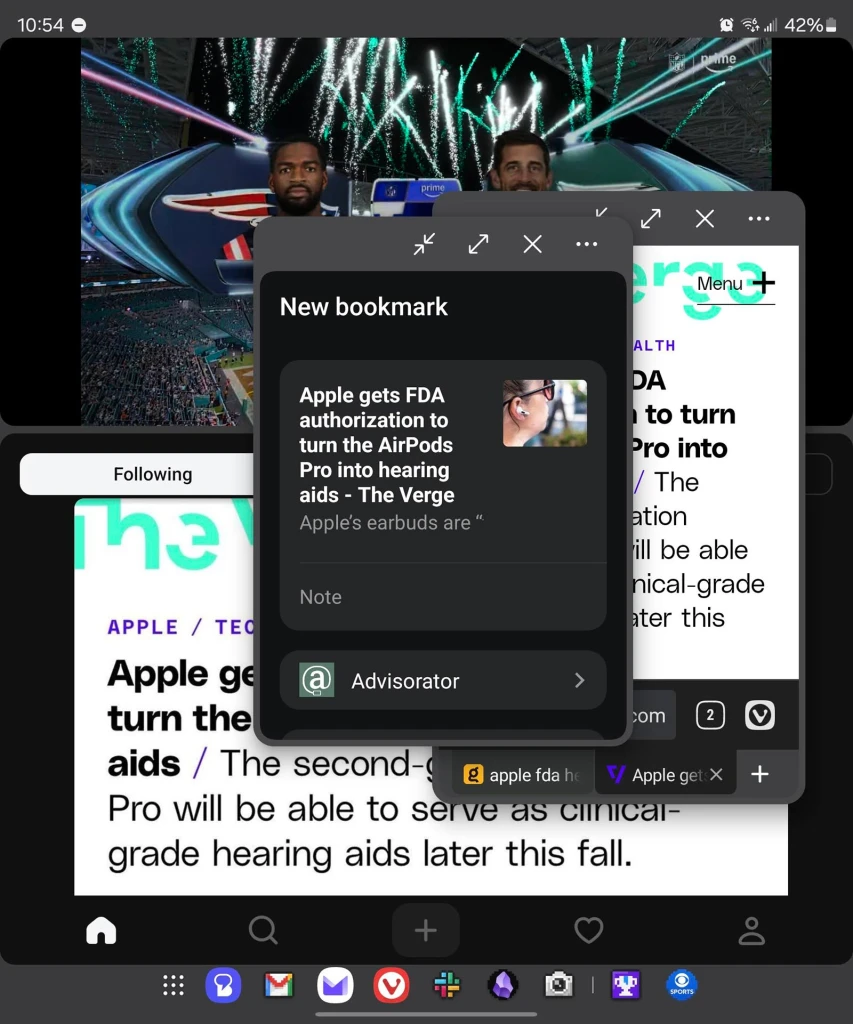
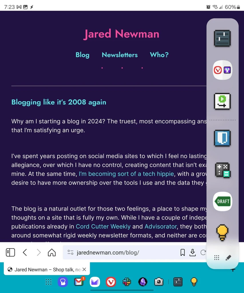
In practice, that means I can watch sports on half the screen while scrolling through social media on the other. And if I see something that I want to look up in a browser or add to my notes, I can do that in a pop-up window without exiting the apps behind it. There’s even a customizable sidebar menu, where you can store a handful of commonly used apps or split-screen combinations. I use this all the time for utilities I often need but don’t want taking up space in the dock, like my password manager, calculator, and Google Keep notepad.
Multitasking on the Pixel 9 Pro Fold is limited to running two apps side-by-side, with no floating windows or split-screen presets, and you can’t stack two apps vertically without rotating the phone onto its side. On a $1,800 device that caters to tech enthusiasts, this feels like wasted potential. (Google did just announce a windowing feature for Android tablets, so perhaps more powerful multitasking will follow.)
I have a nitpick with Google’s foldable home screen situation as well: The Pixel 9 Pro Fold uses the same app arrangement on both the outer and inner screens, with the former’s second page occupying the extra space on the latter. But if you put more than four apps on the inner screen’s dock, they simply do not appear when the phone is closed. If you want access to those extra docked apps, you need to also add them to a page on the home screen. Samsung instead uses separate layouts for the inner and outer screens, which takes more work to set up but makes more sense when you do.
And while I’m probably in the minority here, I like that the Samsung’s phone is slimmer than usual when folded. It’s much easier to use with one hand when you’re on the move, and it serves as a subtle reminder to unfurl the phone into tablet mode when you’re lounging around.
The Pixel 9 Pro Fold lives in more of an uncanny valley. It feels enough like a normal phone on the outside that I’d often forget to flip it open into tablet mode, yet the added weight, extra thickness, and space around the hinge all make it just slightly harder to hold.
Enter Honor
Around the time that I was testing the Pixel 9 Pro Fold, Honor also sent a Magic V3 for review. Compared to the designs of Google’s and Samsung’s foldables, it feels like the best of both worlds.
It has a slimmer hinge than any other large foldable, and its batteries consist of 10% silicon carbon anode material, allowing them to be denser than batteries with all-graphite anodes. The previous Magic V2 was already the thinnest book-style foldable phone, and the Magic V3 is 0.7mm thinner, measuring 9.2mm outside its rear camera bump. It’s only about 12% thicker and 14% heavier than an iPhone 16 Pro Max.
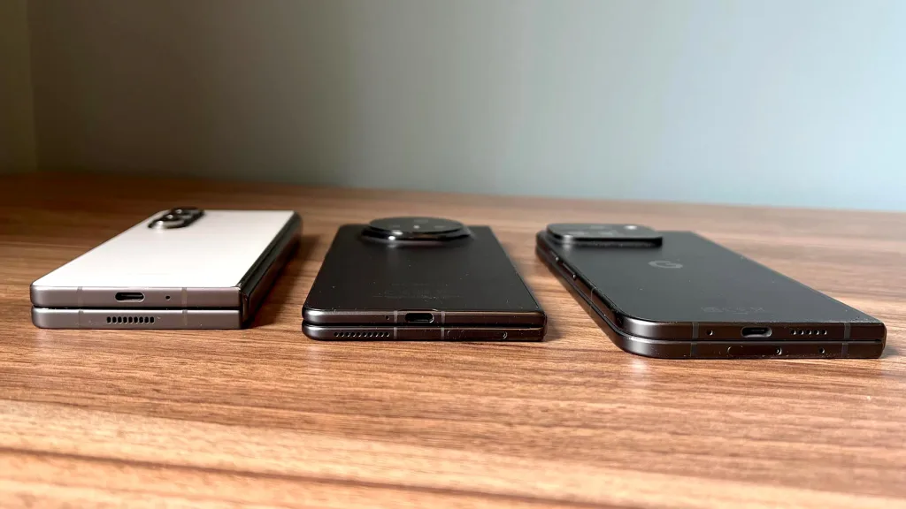
Honor also got the proportions just right. The outer screen is slightly taller and wider than the Pixel 9 Pro Fold, but the slimmer and lighter chassis makes it easier to use one-handed. When you open it up, it’s not quite as square-shaped, so there’s a clearer distinction between portrait and landscape modes. On hardware alone, it’s basically perfect.
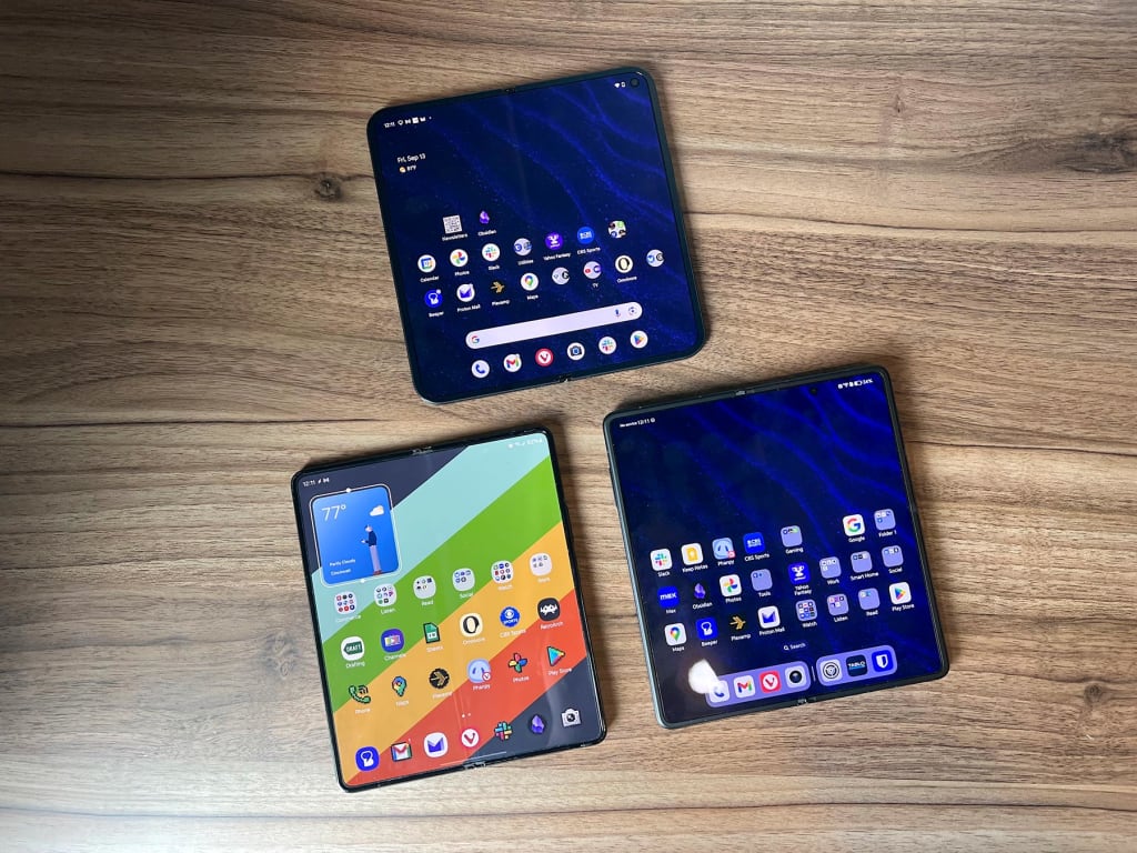
But I wouldn’t want to buy one. For one thing, it’s only available for purchase in China and Europe, and when I tried putting in my SIM card, AT&T rejected it and disabled my line’s internet connection. Even after switching back to the Pixel, I had to spend 40 minutes getting AT&T customer service to bring me back online.
Even if the cellular connection worked, Honor’s software is insufferable. It replaces Android’s excellent swipe-down menu with separate panels for notifications and quick settings, and the phone constantly interrupts you to promote various features and gimmicks. It’s also one of the last phones to abstain from offering an app drawer, instead plunking every icon on the home screen and forcing you arrange them one-by-one. Even Apple realized a couple years ago that this is not the best way.
Which foldable phone is best?
As a Galaxy Z Fold5 owner, I’m clearly susceptible to confirmation bias, but if I was doing it again today, I’d still stick with Samsung and opt for a Fold6.
At this price, I don’t want to forget that it’s a foldable phone. It should be easy to use one-handed on the outside, but when the inner screen is open, it should act like a more powerful computer. The Pixel 9 Pro Fold and Honor Magic V3 both get a lot of things right, but the Samsung still comes the closest to that ideal, both in hardware in software.
It’s still not the perfect foldable phone, though, because nothing is. Maybe next year.
Check out Jared’s Advisorator newsletter for more tech advice.


