Why the ‘Fast Company’ homepage looks a little different today
Finding this article might be easier today than it was yesterday. That’s because Fast Company has just launched a brand new homepage designed to showcase more of the content that readers come to this site for: sharp takes on business news, tech trends, design stories, workplace etiquette, and more. The in-house design team behind the refresh conducted extensive audience research to understand what Fast Company readers are looking for when they visit our site. They found that users want a more fleshed out homepage, a more personalized reading experience, and an easier point of entry to trending stories. The last time that Fast Company tweaked its homepage was around 2018, in an era when a bulk of web traffic came from outside referrals, like Facebook’s now-defunct news tab and Google’s algorithm. Today, those kinds of referrals are a much less reliable source of readership for publications—meaning that the homepage is back in the spotlight. “Ten years ago, people were saying, ‘The homepage is dead,’” says Fast Company’s product director, Cayleigh Parrish. “Everyone was getting their news from socials and newsletters. Now there’s a push to bring people back to our sites.” According to Parrish, Fast Company’s previous homepage—which highlighted a banner of three stories selected by editors—was engineered to be aesthetically pleasing, but it wasn’t necessarily optimized for functionality. Further, the design team’s research showed that, despite a recent emphasis on mobile-first design, most visitors to Fast Company’s homepage are actually checking the page from their desktop, looking for a summary of the day’s most important takeaways. “Social media is still a major draw for us, but people are coming to read specific articles from their shares,” says Eric Perry, digital design director for Mansueto Ventures, Fast Company’s parent company. “When they want to see what we’re up to as a whole, or see what our brand is looking like, they make a point to go to their computer and look at the homepage.” A more personalized Fast Company To land on a new design that would address these findings, Parrish and Perry mocked up multiple iterations of the homepage, which then went through several rounds of in-depth user testing. The final look is still distinctly Fast Company. It uses a streamlined set of recognizable fonts and the same organization of each web vertical. As before, these can be found in a bar at the top of the page. Now, though, the homepage displays around triple the content above the fold as the previous iteration. One top story is featured in the center, while other relevant pieces are organized to the left. On the right, there’s a new section with a tool that toggles between “Most Read” and “For You” sections. Trending stories are displayed under Most Read, guiding readers straight to the content that others are most interested in. For You collates stories based on each users’ past searches and clicks, giving each individual a more personalized window into the site. The refresh also places a greater visual emphasis on text, offering readers a more detailed description of the day’s top stories at a glance. Parrish says the changes are a new “baseline,” and the team plans to continue to iterate on the updated homepage based on reader feedback. “The goal is to make it feel more newsy and alive,” Parrish says.

Finding this article might be easier today than it was yesterday.
That’s because Fast Company has just launched a brand new homepage designed to showcase more of the content that readers come to this site for: sharp takes on business news, tech trends, design stories, workplace etiquette, and more. The in-house design team behind the refresh conducted extensive audience research to understand what Fast Company readers are looking for when they visit our site. They found that users want a more fleshed out homepage, a more personalized reading experience, and an easier point of entry to trending stories.
The last time that Fast Company tweaked its homepage was around 2018, in an era when a bulk of web traffic came from outside referrals, like Facebook’s now-defunct news tab and Google’s algorithm. Today, those kinds of referrals are a much less reliable source of readership for publications—meaning that the homepage is back in the spotlight.
“Ten years ago, people were saying, ‘The homepage is dead,’” says Fast Company’s product director, Cayleigh Parrish. “Everyone was getting their news from socials and newsletters. Now there’s a push to bring people back to our sites.”
According to Parrish, Fast Company’s previous homepage—which highlighted a banner of three stories selected by editors—was engineered to be aesthetically pleasing, but it wasn’t necessarily optimized for functionality. Further, the design team’s research showed that, despite a recent emphasis on mobile-first design, most visitors to Fast Company’s homepage are actually checking the page from their desktop, looking for a summary of the day’s most important takeaways.
“Social media is still a major draw for us, but people are coming to read specific articles from their shares,” says Eric Perry, digital design director for Mansueto Ventures, Fast Company’s parent company. “When they want to see what we’re up to as a whole, or see what our brand is looking like, they make a point to go to their computer and look at the homepage.”
A more personalized Fast Company
To land on a new design that would address these findings, Parrish and Perry mocked up multiple iterations of the homepage, which then went through several rounds of in-depth user testing. The final look is still distinctly Fast Company. It uses a streamlined set of recognizable fonts and the same organization of each web vertical. As before, these can be found in a bar at the top of the page.
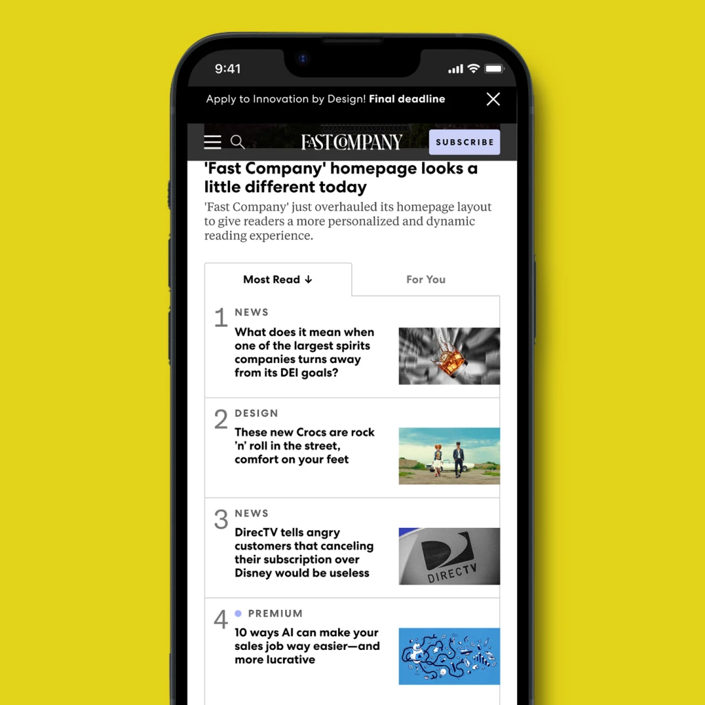
Now, though, the homepage displays around triple the content above the fold as the previous iteration. One top story is featured in the center, while other relevant pieces are organized to the left. On the right, there’s a new section with a tool that toggles between “Most Read” and “For You” sections.
Trending stories are displayed under Most Read, guiding readers straight to the content that others are most interested in. For You collates stories based on each users’ past searches and clicks, giving each individual a more personalized window into the site. The refresh also places a greater visual emphasis on text, offering readers a more detailed description of the day’s top stories at a glance.
Parrish says the changes are a new “baseline,” and the team plans to continue to iterate on the updated homepage based on reader feedback.
“The goal is to make it feel more newsy and alive,” Parrish says.

