These 3 designers turned their biggest failures into success—here’s how
Failure is often said to be the best teacher. And in the design world, no matter the speciality, failure is also a constant companion. From the brainstorming phase to prototyping and production, small mistakes serve as stepping stones toward an eventual product. And sometimes, the product in itself just doesn’t get off the ground—that, too, is a ubiquitous learning experience.But while so-called “failures” are an unavoidable part of working in design, it’s much more common to hear about the success story behind a finished product than all of the iterations that were scrapped before it, or the project that had to be put on pause to make way for something new.At Fast Company, we reached out to three successful designers in different fields to ask about the story behind a “failed“ or rejected design and what it taught them. Here’s what they told us about the lessons failure teaches.Yves Béhar [Photo: Alanna Hale]Yves Béhar, founder of Fuseproject: The Learning ShoeThe design Years before the advent of technology like the Apple Vision Pro, Humane’s Ai pin, or even the now-passé Fitbit, multidisciplinary designer Yves Béhar was busy thinking up one of the first-ever mainstream iterations of wearable tech.Today, Béhar is best known for taking an eccentric, Renaissance man approach to his career—designing everything from Herman Miller furniture to New York City’s official condom dispensers, a 8 mm Kodak camera, and an eldercare robot. And 25 years ago, Béhar had already made a splash in the design world with branding work for giants including Hewlett-Packard and Apple. [Image: courtesy Fuseproject]It was 1999, and, just eight years out of college, Béhar was already moving on from the first phase of his career and working on founding his own design firm, Fuseproject. That same year, the San Francisco Museum of Modern Art reached out to Béhar for his take on a special concept: imagining “the future of the shoe.”[Image: courtesy Fuseproject]Béhar’s concept, the “Learning Shoe,” had what he calls “a very Californian flip-flop design,” reminiscent of a futuristic jelly sandal. Its core innovation, though, could be replicated in any type of shoe. “It was a bright elastomeric sandal that, through a chip (pre-sensor), would measure a user’s typical walk and gait, pronation, and weight,” Béhar says.[Image: courtesy Fuseproject]In theory, after all the data had been collected, the chip would be removed and sent back to the manufacturer. Then, the shoe company would be able to craft a custom-fit pair of kicks for each individual based on their “evolving ergonomic needs.” Béhar was excited about the idea of sportswear companies competing not just on style, but also on their ability to customize products to each individual wearer.“The design explored an idea unknown at the time: that of a connected wearable,” Béhar says. “In 1999 there was no such thing as wearables, no Wi-Fi or Bluetooth to connect a product. It was an early exploration into an unknown future that turned out to be a major part of our work at Fuseproject five to 10 years later.”What went wrongThroughout his career, Béhar’s exuberant approach to new ideas has led to many out-of-the-box designs—some of which landed better than others. The Learning Shoe, it seems, was mostly a case of right design, wrong time.“The design was very well received, was viewed both in person and in the press,” Béhar says. “We got calls from Nike and Adidas who wanted to discuss the idea. I could sense that this was something shoe companies saw as a way to create loyalty. One executive told me, ‘We can do this in five years.’”Béhar didn’t go into detail on why Nike and Adidas ultimately passed on the tech, but it seems likely that it was a difficult idea to execute on a wide scale—especially in a pre-WiFi era. In 2003, the idea briefly reappeared as a Birkenstock prototype that never went into production. The Learning Shoe idea is perhaps most comparable to a health tracking wearable, which started to gain popularity in the late aughts with the release of the Fitbit in 2009, followed by the Apple Watch in 2015. Now, over two decades later and well into a more dystopian era of the wearable (see Avi Schiffmann’s Friend AI necklace), Béhar says he wants to give the Learning Shoe another try: “I’m finally working on launching it and making it real . . . let’s see if it happens, but I never lost hope.”[Image: courtesy Fuseproject]Lesson learned While the Learning Shoe may not have seen much traction on the ground back in 1999, Béhar says the design process still taught him two important lessons. First, he says, future concepts “get great attention and create new connections with industry leaders.” And second, “timing and patience are qualities that are hard to acquire as a designer, as we often feel that we have the power to move people to our ideas.”These insights have informed Béhar’s current approach to helming Fuseproject, which was partially acquired in 2017 before Béhar swooped in to
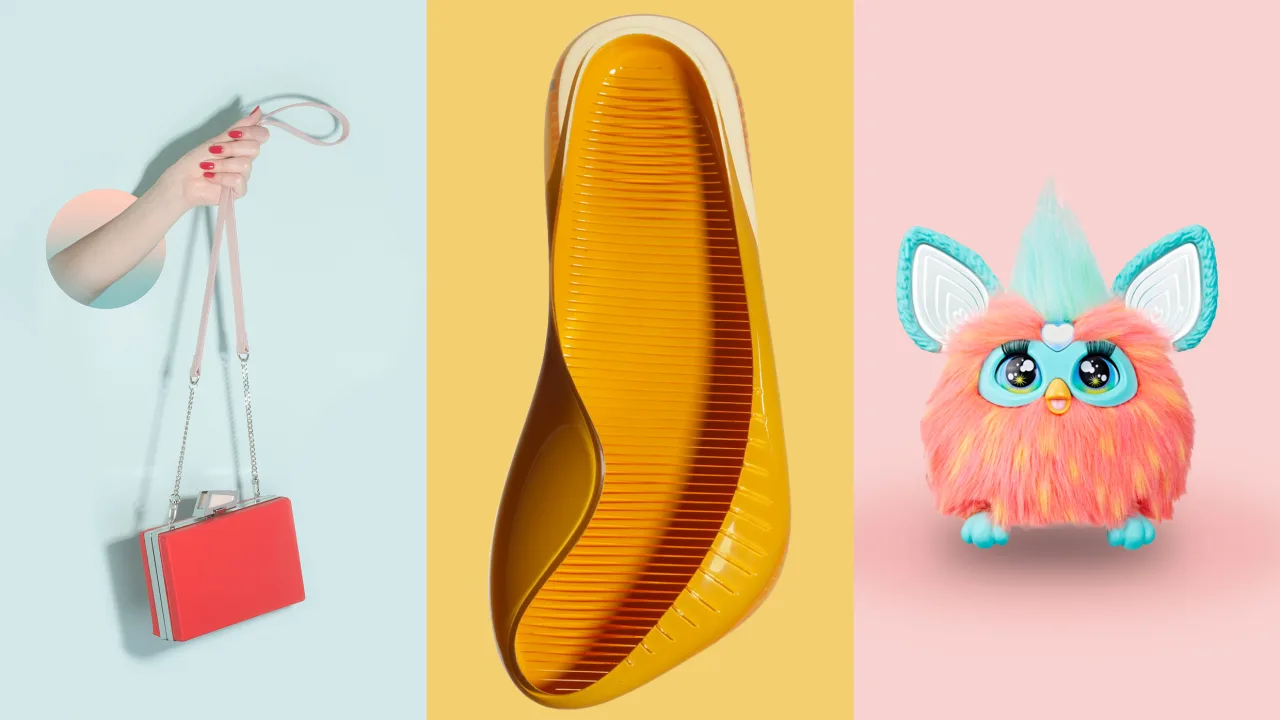
Failure is often said to be the best teacher. And in the design world, no matter the speciality, failure is also a constant companion. From the brainstorming phase to prototyping and production, small mistakes serve as stepping stones toward an eventual product. And sometimes, the product in itself just doesn’t get off the ground—that, too, is a ubiquitous learning experience.
But while so-called “failures” are an unavoidable part of working in design, it’s much more common to hear about the success story behind a finished product than all of the iterations that were scrapped before it, or the project that had to be put on pause to make way for something new.
At Fast Company, we reached out to three successful designers in different fields to ask about the story behind a “failed“ or rejected design and what it taught them. Here’s what they told us about the lessons failure teaches.
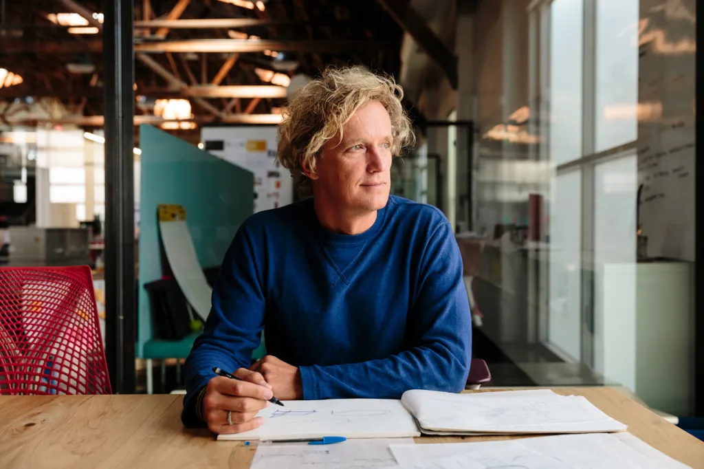
Yves Béhar, founder of Fuseproject: The Learning Shoe
The design
Years before the advent of technology like the Apple Vision Pro, Humane’s Ai pin, or even the now-passé Fitbit, multidisciplinary designer Yves Béhar was busy thinking up one of the first-ever mainstream iterations of wearable tech.
Today, Béhar is best known for taking an eccentric, Renaissance man approach to his career—designing everything from Herman Miller furniture to New York City’s official condom dispensers, a 8 mm Kodak camera, and an eldercare robot. And 25 years ago, Béhar had already made a splash in the design world with branding work for giants including Hewlett-Packard and Apple.
It was 1999, and, just eight years out of college, Béhar was already moving on from the first phase of his career and working on founding his own design firm, Fuseproject. That same year, the San Francisco Museum of Modern Art reached out to Béhar for his take on a special concept: imagining “the future of the shoe.”
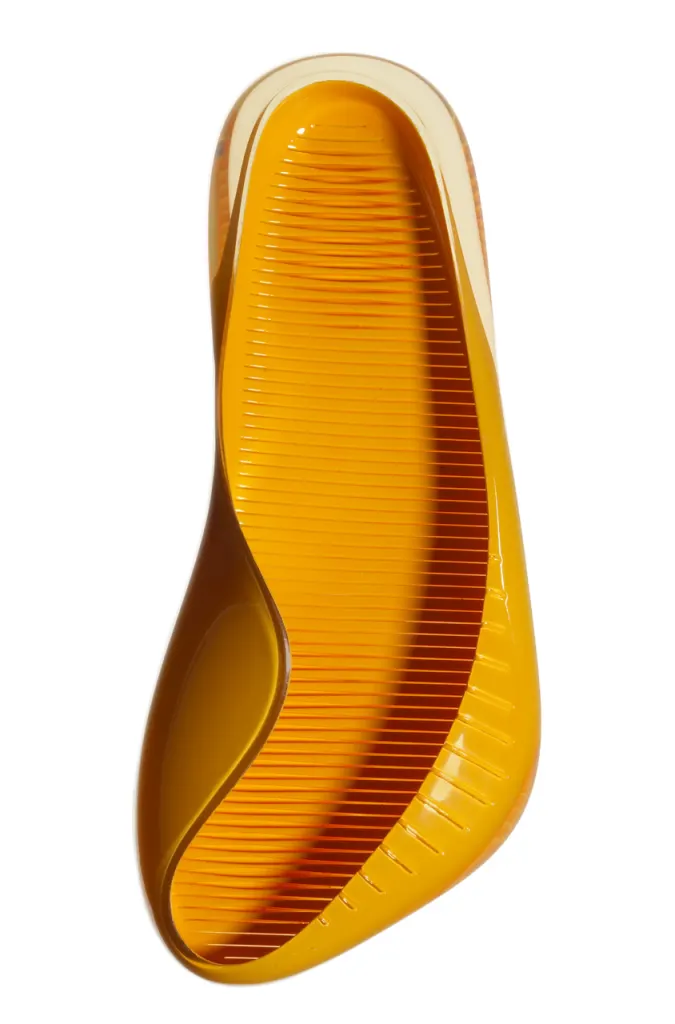
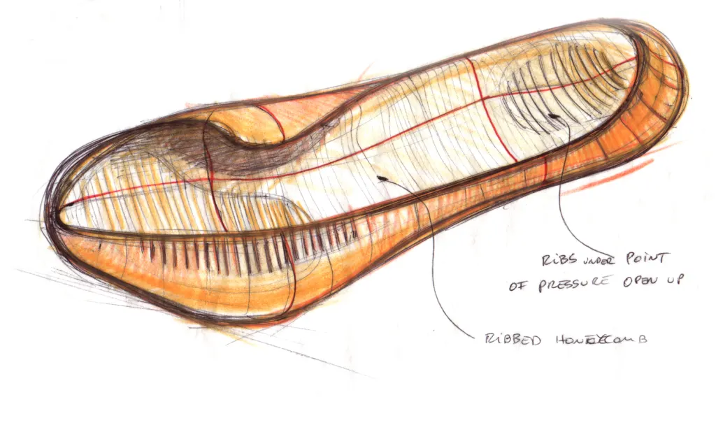
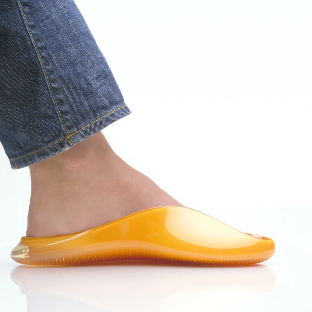
Béhar’s concept, the “Learning Shoe,” had what he calls “a very Californian flip-flop design,” reminiscent of a futuristic jelly sandal. Its core innovation, though, could be replicated in any type of shoe. “It was a bright elastomeric sandal that, through a chip (pre-sensor), would measure a user’s typical walk and gait, pronation, and weight,” Béhar says.
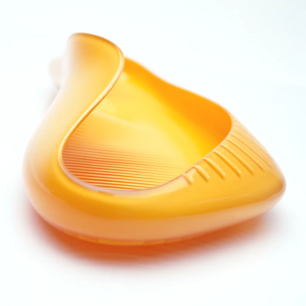
In theory, after all the data had been collected, the chip would be removed and sent back to the manufacturer. Then, the shoe company would be able to craft a custom-fit pair of kicks for each individual based on their “evolving ergonomic needs.” Béhar was excited about the idea of sportswear companies competing not just on style, but also on their ability to customize products to each individual wearer.
“The design explored an idea unknown at the time: that of a connected wearable,” Béhar says. “In 1999 there was no such thing as wearables, no Wi-Fi or Bluetooth to connect a product. It was an early exploration into an unknown future that turned out to be a major part of our work at Fuseproject five to 10 years later.”
What went wrong
Throughout his career, Béhar’s exuberant approach to new ideas has led to many out-of-the-box designs—some of which landed better than others. The Learning Shoe, it seems, was mostly a case of right design, wrong time.
“The design was very well received, was viewed both in person and in the press,” Béhar says. “We got calls from Nike and Adidas who wanted to discuss the idea. I could sense that this was something shoe companies saw as a way to create loyalty. One executive told me, ‘We can do this in five years.’”
Béhar didn’t go into detail on why Nike and Adidas ultimately passed on the tech, but it seems likely that it was a difficult idea to execute on a wide scale—especially in a pre-WiFi era. In 2003, the idea briefly reappeared as a Birkenstock prototype that never went into production.
The Learning Shoe idea is perhaps most comparable to a health tracking wearable, which started to gain popularity in the late aughts with the release of the Fitbit in 2009, followed by the Apple Watch in 2015. Now, over two decades later and well into a more dystopian era of the wearable (see Avi Schiffmann’s Friend AI necklace), Béhar says he wants to give the Learning Shoe another try: “I’m finally working on launching it and making it real . . . let’s see if it happens, but I never lost hope.”
Lesson learned
While the Learning Shoe may not have seen much traction on the ground back in 1999, Béhar says the design process still taught him two important lessons. First, he says, future concepts “get great attention and create new connections with industry leaders.” And second, “timing and patience are qualities that are hard to acquire as a designer, as we often feel that we have the power to move people to our ideas.”
These insights have informed Béhar’s current approach to helming Fuseproject, which was partially acquired in 2017 before Béhar swooped in to buy it back last year. Now, he’s helping the company pivot back to its original strategy of joining forces with design startups, either as equity partners or cofounders.
“There is too often a sense of rush and of needing to be first to market,” Béhar says. “The consequences of prematurely launching a product that may not be fully resolved are devastating, and result in startup failure. Nowadays, the product, brand, and strategy being ‘right’ is what we advocate, balancing the need for speed with the patience to get it right.”
Béhar’s advice for other designers feeling discouraged by failure or rejection: “Failure is a daily occurrence for a designer: Most sketches are not the right direction; most mock-ups and prototypes have issues. What’s important is to see those daily failures as stepping stones and learnings that help us resolve and refine the product, experience, and brand. And rejection of our designs should be looked at more as stimuli for making our ideas better and for convincing the world that our ideas will get validated over time.”

Melissa Jones, Hasbro product designer: 2023 Furby
The design
For the 1900 Paris World Exhibition, a French toy manufacturer asked artists to depict what life at the turn of the century might look like. Many of the results imagined how robots might feature in the average home, from a lipstick-applying droid to a cleaning bot and a mechanized barber. But when the turn of the century actually arrived, the first truly successful domestic robot was something totally different: the Furby.
The Furby—a hairy, bug-eyed, ambiguously animal toy—was first released in 1998 by Tiger Electronics, to major commercial success. Its core innovations were the ability to speak its own language (Furbish), respond to voice commands, and learn English, all of which made it seem like a sentient playmate. In its first iteration, the Furby couldn’t be turned off unless its batteries were removed, meaning that it was magical for kids and a source of infinite annoyance for adults. More than 40 million Furbies were sold in the first three years of production, and after Hasbro bought the license to the property, six additional generations of the toy were released.
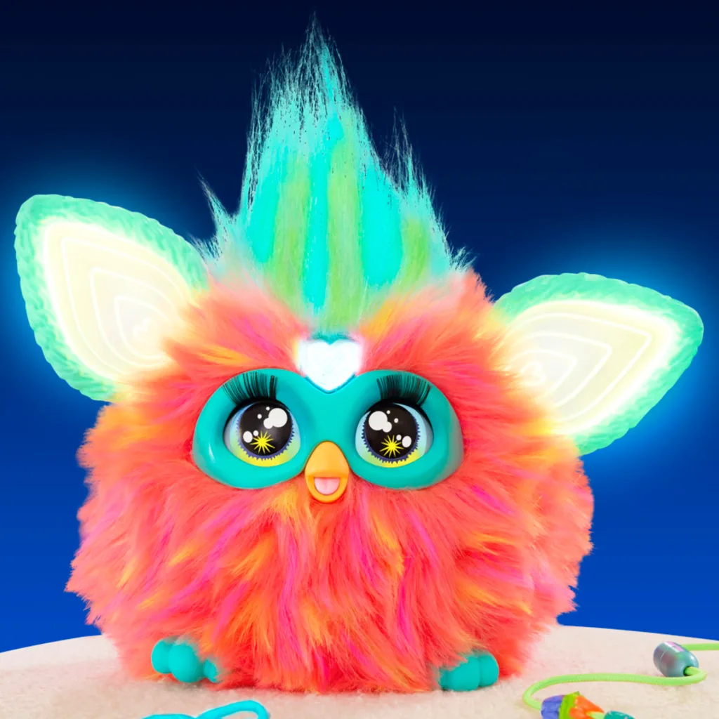
After a multiyear hiatus, Hasbro recently returned to the drawing board to whip up a new Furby model for the modern kid—and the pressure was on to make it the most high-tech (and least creepy) version yet.
Melissa Jones, Hasbro’s principal product designer in the fashion and preschool departments, was one of the creatives tasked with imagining the 2023 Furby. Before Jones joined the Furby team, she says other designers had already been working on “incubating the brand” and had received mixed reviews on initial prototypes from kids and parents—so much so that they decided to start at square one and delay the product launch.
“We did a lot of analysis of what we should hold on to and what should change as we moved ahead,” Jones says. “I got to participate in our all-day ‘Furby Summit,’ where the team brainstormed what Furby could be by working together and throwing out crazy ideas.”
Ultimately, all of the outlandish possibilities were narrowed down to a few final contenders. The standout favorite was an innovation in what Jones calls “fur technology,” which, she says, would “make the fur ALIVE.”
“Since Furby always has a wow factor of innovation in every generation that it launches, we all strongly felt this was the answer,” Jones says. “The concept went through our consumer testing and was top of the list among other concepts. The team started creating breadboards that could work in theory. Signs pointed to the possibility of it working in the toy, though as we started getting closer to more accurate models, we realized we had many hurdles ahead.”
What went wrong
Implementing the living fur turned out to be more of a challenge than initially expected. According to Jones, the production execution lacked the “wow factor” her team was looking for. If they wanted to make it work, they would have to sacrifice many of the key attributes that “make a Furby a Furby.” After many troubleshooting attempts—and just before the final stage of consumer testing—the team made the difficult decision to start over yet again.
“We all regrouped, took a fresh look at the work we had done through our brainstorming, gathered all our insights from previous testing, and realized we may be going too heavy from an innovation-led angle,” Jones says.
Instead of prioritizing a never-before-seen innovation, Jones’s team decided to focus on how the modern Furby could interact with kids in new ways. “With that approach, we focused on the child’s interaction and the magic of speaking to Furby to unlock their unique friendship. This at the core, with all the music and lights, sparked the new direction,” Jones says.
Lesson learned
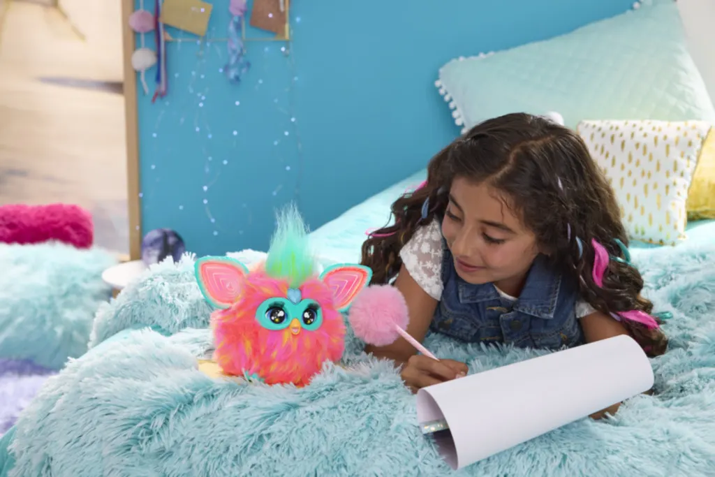
The final 2023 Furby comes with five voice-activated modes (including chilling, partying, and fortune-telling) that each include accompanying light shows and music, which can change when the user taps the Furby on the head or tummy. The Furby also responds to kids with more than 600 phrases, and can easily be turned on and off.
“Overall, our new Furby was very well received and now has a place in the Furby family,” Jones says.
For Jones, the main takeaway from all of the trial and error was to find solutions through brainstorming with team members.
“Although we had some shifts over the years, I noticed while working on the Furby brand the most progress and amazing ideas came from when we collaborated together and listened to each other,” Jones says. “When it came to executing, each part of the team put trust in the other’s expertise, and this environment allowed us to still have a creative mindset and determination to get this new Furby to the generation of kids today. Each team member brought innovative ideas to the table to help with our cost and timing challenges.”
Jones’s advice for other designers feeling discouraged by failure or rejection: “As the whole Furby team can contest, failure can lead to success, it just may not be the path you are currently on—but you have building blocks to work from and can analyze why it didn’t succeed. Sometimes looking back on old ideas with your team might shine a light on a new perspective and lead you down a successful path. Sometimes the best brainstorms are bringing out prototypes or sketches that didn’t make it to production and starting from there. It just takes someone to make it fresh again. Sharing, listening, and supporting the people around you is a great way to feel refreshed and inspired.”
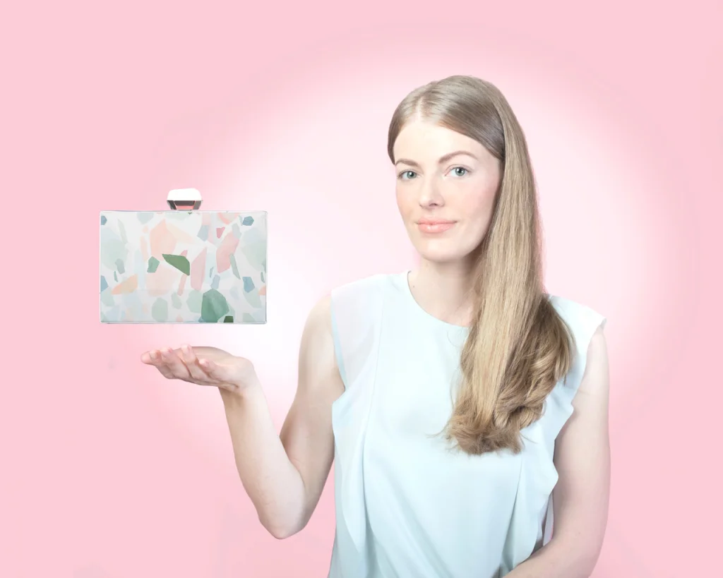
Eliana Ghantous, fashion entrepreneur and product developer: Modjewel handbags
The design
Designer Eliana Ghantous is hardwired to imagine how things were built. That’s because, given her background in nanotechnology engineering, she’s well-versed in building objects that others might not even know exist—like sealants for fuel tanks and tiny magnets for cars. So, it stands to reason that her fashion startup, Modjewel, began when she decided to tear apart her handbag to better understand how it worked.
The deconstruction was the first step toward prototyping an idea Ghantous had been considering for some time. What if, instead of buying multiple bags for different occasions and outfits, a consumer could purchase one sustainable bag that would transform to fit any scenario?
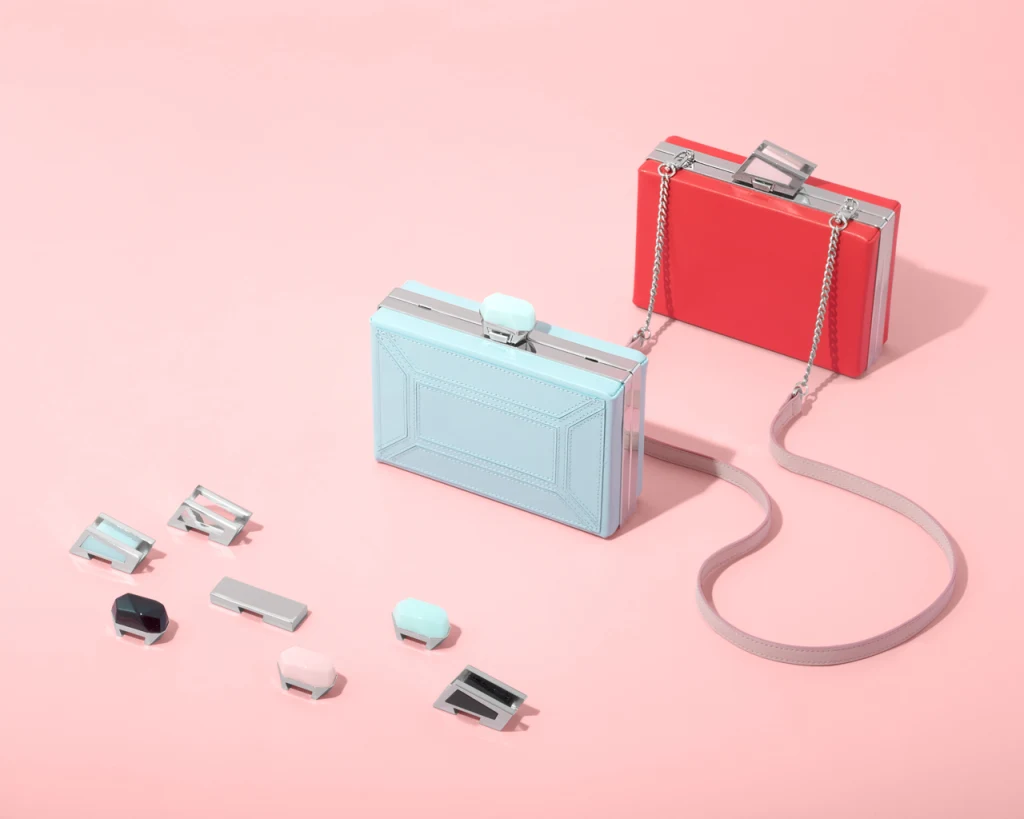
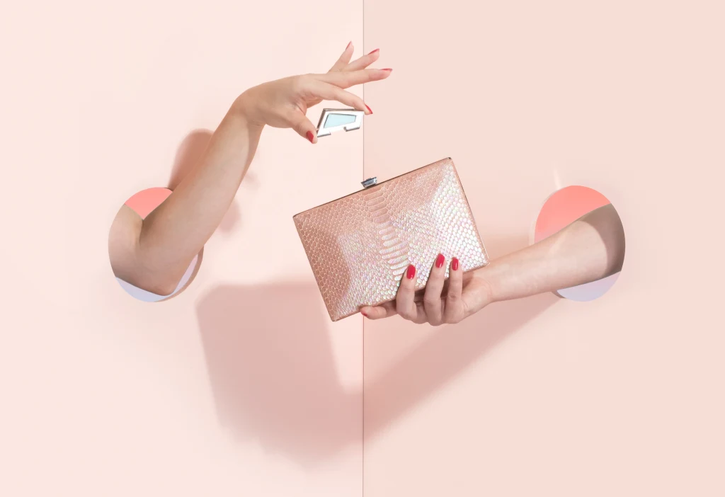
“Modjewel’s design revolved around a modular clutch bag system,” Ghantous says. “It aimed to provide customers with a versatile accessory that could be easily customized to fit various occasions and personal styles. The core concept was to offer interchangeable ‘modules,’ such as covers and clasps, that could be swapped out to create different looks without requiring multiple bags.”
Ghantous developed the first iteration of a swappable clasp with help from her husband, who works in mechanical engineering. As the idea for Modjewel became more fleshed out, the pair sought help from Liz Daily, a soft-goods industrial designer, to create a more final test bag.
“Over two years, Modjewel researched, prototyped, and perfected the sustainable handbag system, featuring patent-pending clasp and shell mechanisms to change the covers,” Ghantous says. “Shielded internal magnets, engineered to avoid credit card interference, made changing the bag’s exterior as simple as removing the shell, wrapping a new cover around it, and reattaching it. Clasps could also be released and swapped out with a simple click.”
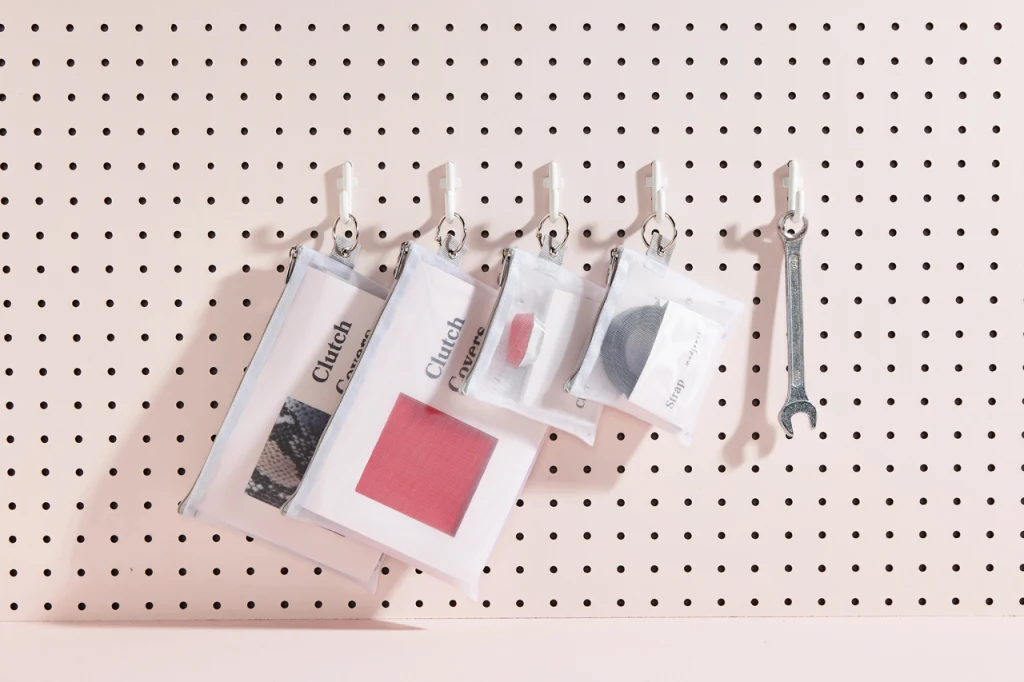
True to Ghantous’s roots in material science, every detail of the clutch system was fine-tuned, from the exact strength of the shell magnets to the size of the steel discs that were used to shield credit cards from magnetic interference. All of the final bag’s components were swappable, including the leather front and back covers, the top clasps, and the straps.
The final product launched in 2016. Each base bag retailed for $198, while a full set of components would cost $352. In a 2017 interview with Fast Company about Modjewel, Ghantous posited that a woman would theoretically only need one bag to get through the many events in her life: “A clutch is something that you don’t carry all the time,” she explained. “So it doesn’t make sense to have 15 different versions in your closet.”
What went wrong
In many senses, Modjewel was a success: The company did make it to market, and it largely received positive feedback from consumers (including from Fast Company’s own senior staff writer Elizabeth Segran).
Ghantous says, for the purposes of this story, she chose to interpret the idea of “failure” as in “the design didn’t fully solve a customer’s need or no product-market fit was found through the design of the product.” With Modjewel, she was able to realize her vision of the fully customizable clutch—but marketing it was another matter.
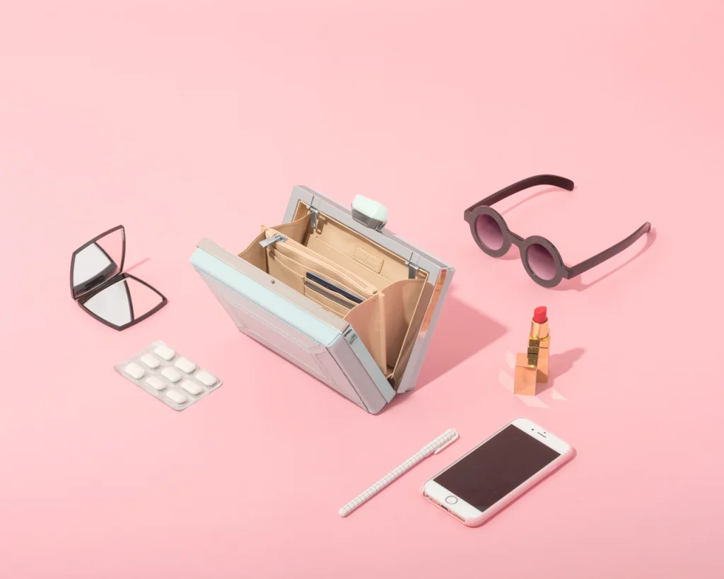
“Despite the aesthetic appeal and innovative design, the Modjewel handbag ultimately fell short of expectations due to several factors,” Ghantous says. “One significant issue was a lack of validation for assumptions made during the design process. The modular nature of the bag, while novel, proved to be overly complex for consumers to grasp. This complexity also presented challenges in manufacturing and sales to boutiques. While I initially envisioned a direct-to-consumer business model, I underestimated the marketing efforts required to educate customers about the product, especially considering the higher price point.”
Modjewel continued operations for five years before its business challenges ultimately led Ghantous and her team to close up shop.
Lesson learned
Running Modjewel was a key learning experience for Ghantous, who has gone on to head several product management teams and currently works as a founding member and principal product manager at Nocklo, a fintech startup. First, she says, she still loves the process of building something from scratch, but nowadays, she spends a lot more time “understanding the problem rather than jumping and obsessing about the solution right away.”
“After the experience of launching and running Modjewel, I learned to approach design and product development in a much more customer-centric and lean way,” Ghantous says. “With Modjewel, I fell in love with the concept, and didn’t spend nearly as much time thinking about the problem to be solved, understanding my ideal customer and actually talking to customers. Now I know how important it is to articulate the problem to be solved prior to designing. After all, if a design does not solve a problem, what is its purpose?”
Ghantous’s advice for other designers feeling discouraged by failure or rejection:
“I would conduct a ‘retro’ to understand why the design has failed or got rejected. Did it fail to meet customer needs? Did it fail to satisfy stakeholders in the project? What was the impact of the design failure on the business? Are there any metrics you could review to help inform improvements and next iterations? Are there others in the team you could brainstorm improvements with? Are there any changes in the design process that should be done in order to get to a design that is satisfactory?”


