Reexamining the spread of COVID-19 using DDX Bricks
… The post Reexamining the spread of COVID-19 using DDX Bricks first appeared on Blog.

As Domo’s director of data insights, I get asked a lot of questions about Domo products. But, for whatever reason, there’s one product feature in particular that I get asked about the most: DDX Bricks.
DDX Bricks are data app templates that allow you to create low-code apps no matter your technical experience. But their appeal extends far beyond that. They also are a great way for you to add some wow factor to your visualizations—and, in turn, tell more compelling data stories.
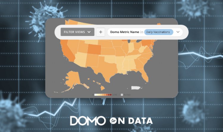
Take, for instance, the DDX brick-powered map directly below, which shows the spread of COVID-19 in the U.S. over the first two months of 2022:
By having a lot of pre-built bricks to choose from, DDX Bricks also lower the barrier to creating your own data app. Select the brick you want, connect up the data, and voila!—you have a functioning data story to tell.
If you want to change or tweak some things in the brick, that’s easy to do, too. Often the code is commented with what different variables are, which makes changing them simple—even if you’re not familiar with the language.
Case in point: When I created my first DDX brick around the Tokyo 2020 Summer Olympics, I had no experience with JavaScript. But it didn’t matter; I had a pre-made brick that was easy to modify, so I could tweak things such as the cycle time between changes, the displayed date, and the cadence between date changes.
But back to the COVID brick, which I created by modifying another brick from the Domo Appstore. I hear a lot about animated maps showing changes over time, so I decided to create a brick that shows exactly that, using COVID case data over time based on seven-day moving averages:
As you can see, the map tells a pretty interesting story. Select the metric you would like to see (click on the gray, funnel-shaped filter icon to get the filter bar and then select the Vaccinations view) and it will dynamically change the properties of the visualization.
The dates will change to only include the dates that have data for that metric. And the scales will change so that there is a single scale for that metric for the whole timeframe of the data.
Playing through this map on the two different metrics is interesting. When I look at the new case count, I expect to see a big spike around the beginning of COVID, representing the first wave, but it doesn’t really show up. The wave that came through at the beginning of 2022 dwarfs the first wave. Perhaps if I used a log-scale it would better show the smaller waves.
Looking at the number of vaccinations, the biggest wave was obviously in the beginning, with smaller waves showing up later, likely when boosters became available or other demographics became eligible for the vaccines.
The “Domo on Data” team is currently working on converting these DDX Bricks showing maps over time into templates that will be available in the Domo Appstore. When they’re completed, I’ll update this post, as well.
Overall, the process of writing them was pretty simple, and allowed me to tell a data story in a way that I was not able to do before.
The post Reexamining the spread of COVID-19 using DDX Bricks first appeared on Blog.


