PayPal’s smart brand refresh ditches the blue logo it’s had for 20-plus years
PayPal just got a sharp branding refresh, and its wordmark ditches the blue that’s defined it for more than 20 years.Overall, it might seem that the design changes in Paypal’s brand refresh, from Pentagram partner Andrea Trabucco-Campos and his team, are fairly subtle. But a closer inspection reveals why it’s necessary to pay attention to the details. There’s a new bespoke typeface for the wordmark and copy; a crisper monogram; a streamlined color palette, which includes a new color for the wordmark; and new animations that reflect PayPall’s UX. It’s a move that’s intended to help PayPal stand out from its competitors in the fintech space while giving the brand a more universal, accessible look.[Image: courtesy Pentagram]Subtle color differences, big changeFirst, perhaps the most obvious visual change is the updated wordmark. The new PayPal wordmark isn’t oriented at a slant, which is different from all of the workmark’s former iterations, dating back to the company’s launch in 2000. [Image: courtesy Pentagram]The new PayPal wordmark is also black rather than blue. This may not seem like a major visual change on its face, but it’s a strategic move when working within the sea of sameness that is fintech branding. (Consider fintech companies Webull, Revolut, and Wise, for instance.) As the press release clarifies, PayPal’s new color choice “sets it apart from the blue that has become synonymous with fintech.” This choice can also help distinguish PayPal’s brand from the more staid identities of traditional banks like Citi and Chase.As for PayPal’s new color palette as a whole, that, too, has been streamlined down to five core hues that can all be used in combination: white, black, bright blue, deep blue, and medium blue. Yellow, which was one of the brand’s former accent colors, has been fully eliminated from the palette due to its “outdated” look, Pentagram wrote in their release.[Image: courtesy Pentagram]Sharp type, sharper UI motion graphicsThe PayPal wordmark’s custom font is derived from an existing typeface developed by Lineto Type Foundry, called LL Supreme. (LL Supreme itself was based on the iconic sans serif Futura, designed by Paul Renner in 1927. It’s now one of the most common fonts in the design world.) According to Pentagram’s press release, the typeface’s “timeless universal forms” allow readers to focus on the message. “PayPal Pro similarly aims to be constructed purely out of straight lines and circular curves,” it adds. Trabucco-Campos and his team separated the PayPal monogram (two interlocking “P”s) from the wordmark, so that each can be used individually. The monogram is slightly sharpened to match the rest of the refresh. Its colors have also been updated, so that signature color of Venmo, one of PayPal’s subsidiary brands, appears at the monogram’s overlapping, Venn diagram-esque center.Trabucco-Campos’s team also made adjustments to the in-app experience. In the mobile version of PayPal and on its website, they created new animations that mimic the recognizable UI motions of mobile pay, like tapping, swiping, and flipping. The PayPal brand refresh is debuting alongside its new debit card. As the brand continues to expand, its pared-down look aims to make it more versatile for showing up on physical cards, marketing assets, and during day-to-day transactions.
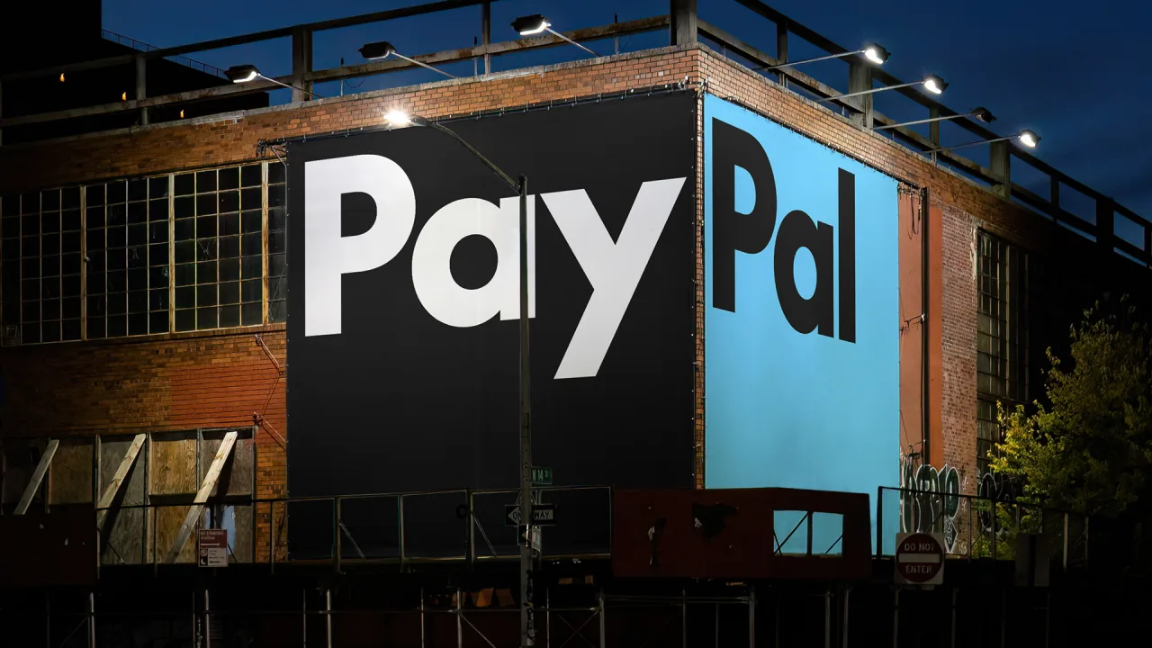
PayPal just got a sharp branding refresh, and its wordmark ditches the blue that’s defined it for more than 20 years.
Overall, it might seem that the design changes in Paypal’s brand refresh, from Pentagram partner Andrea Trabucco-Campos and his team, are fairly subtle. But a closer inspection reveals why it’s necessary to pay attention to the details. There’s a new bespoke typeface for the wordmark and copy; a crisper monogram; a streamlined color palette, which includes a new color for the wordmark; and new animations that reflect PayPall’s UX. It’s a move that’s intended to help PayPal stand out from its competitors in the fintech space while giving the brand a more universal, accessible look.
Subtle color differences, big change
First, perhaps the most obvious visual change is the updated wordmark. The new PayPal wordmark isn’t oriented at a slant, which is different from all of the workmark’s former iterations, dating back to the company’s launch in 2000.
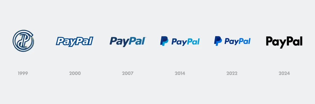
The new PayPal wordmark is also black rather than blue. This may not seem like a major visual change on its face, but it’s a strategic move when working within the sea of sameness that is fintech branding. (Consider fintech companies Webull, Revolut, and Wise, for instance.) As the press release clarifies, PayPal’s new color choice “sets it apart from the blue that has become synonymous with fintech.” This choice can also help distinguish PayPal’s brand from the more staid identities of traditional banks like Citi and Chase.
As for PayPal’s new color palette as a whole, that, too, has been streamlined down to five core hues that can all be used in combination: white, black, bright blue, deep blue, and medium blue. Yellow, which was one of the brand’s former accent colors, has been fully eliminated from the palette due to its “outdated” look, Pentagram wrote in their release.
Sharp type, sharper UI motion graphics
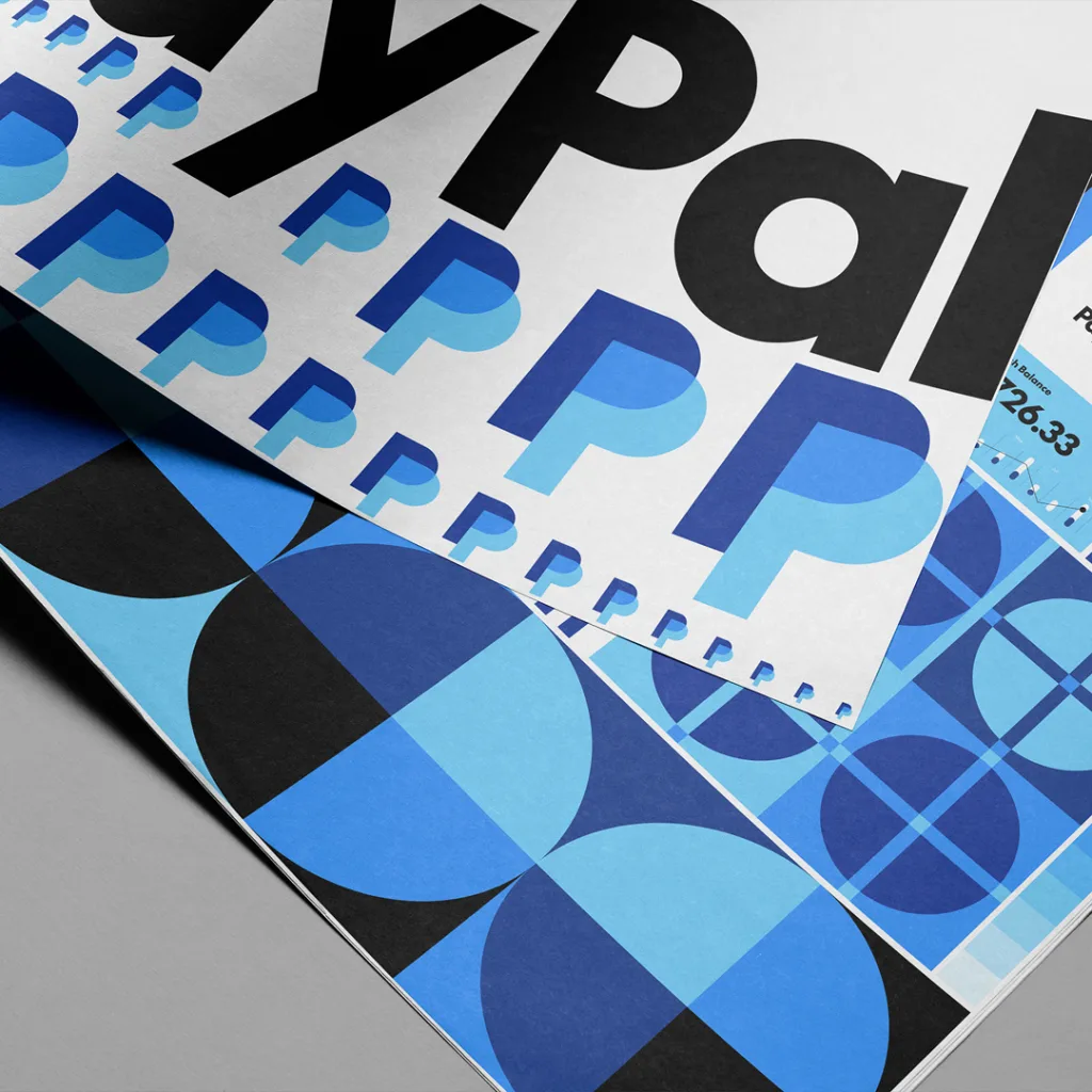
The PayPal wordmark’s custom font is derived from an existing typeface developed by Lineto Type Foundry, called LL Supreme. (LL Supreme itself was based on the iconic sans serif Futura, designed by Paul Renner in 1927. It’s now one of the most common fonts in the design world.) According to Pentagram’s press release, the typeface’s “timeless universal forms” allow readers to focus on the message. “PayPal Pro similarly aims to be constructed purely out of straight lines and circular curves,” it adds.
Trabucco-Campos and his team separated the PayPal monogram (two interlocking “P”s) from the wordmark, so that each can be used individually. The monogram is slightly sharpened to match the rest of the refresh. Its colors have also been updated, so that signature color of Venmo, one of PayPal’s subsidiary brands, appears at the monogram’s overlapping, Venn diagram-esque center.
Trabucco-Campos’s team also made adjustments to the in-app experience. In the mobile version of PayPal and on its website, they created new animations that mimic the recognizable UI motions of mobile pay, like tapping, swiping, and flipping.
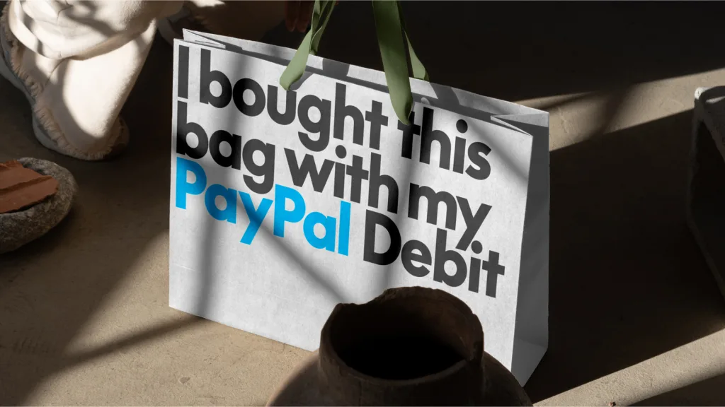
The PayPal brand refresh is debuting alongside its new debit card. As the brand continues to expand, its pared-down look aims to make it more versatile for showing up on physical cards, marketing assets, and during day-to-day transactions.