
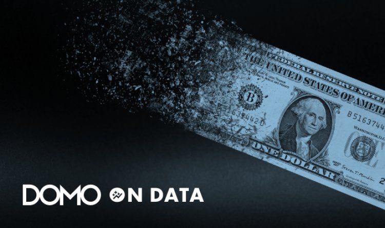
Inflation Nation? What the Data Reveals About Today’s Prices
There has been a lot of talk lately about inflation so it seemed like a great topic for a blog post. In order to get started we went back to our good friends at the Bureau of Labor Statistics who publish detailed data about the Consumer Price Index (CPI) The post Inflation Nation? What the Data Reveals About Today's Prices first appeared on Blog.
There has been a lot of talk lately about inflation, so it seemed like a great topic for a blog post. In order to get started, we went back to our good friends at the Bureau of Labor Statistics, who publish detailed data about the Consumer Price Index (CPI), which lets us look at prices across different categories, geographies, and time periods.
I actually started exploring this data in Domo last week, before January 2022 results were released. Then, while I was finalizing some of these views (directly below), the January results showed up. (Part of what I love about Domo is that I can quickly build an automated data pipeline all on my own.)
For this analysis, we look at the CPI index for a given period compared to the same period last year. Looking by month back to 2017, we can see that prices have been going up since the second quarter of 2021, with a high increase of 7.5% in January 2022. The data goes all the way back to 1998, so if you want to explore previous decades even, you can. You can also select specific categories of goods and see how they have changed:
Continuing to break apart January 2022 CPI numbers (defaulted below, but you can use the filter drop-downs to change to other months or periods), the biggest increases are coming from Motor Fuel and Fuel Oils, which are both up over 30% since last year. You can select one of the Top Categories to filter for the detailed categories in that bucket of CPI.
Interestingly, the areas with the largest drops since last year—which you can see on the detail level—are Food at Elementary Schools and Food at Workplaces, which is not all that surprising given the recent COVID-19 surge and more professionals and students still at home:
As you explore this data, note there are some geographic areas that do not have CPI data for all categories on a monthly level. The chart below looks at the CPI change for the annual average for 2021, which for All Items increased 4.7%. Car and truck rentals last year were up almost 50%.
At the Annual Average level, there is more detailed geographic data. So, for example, I can see that in my home metro of Minneapolis-St. Paul, CPI was up 4.8%, with the biggest increase for Gas at 40%:
Lastly, we can look more specifically at the geographic breakdown of CPI change for 2021. And when we do, we see that the Atlanta metro area saw the highest CPI increase at 6.1%, whereas San Francisco saw the lowest (3.2%):
There’s a lot more to unpack here, but at least the data will continue to update and you can come back to this page and filter for future months to see how inflation is changing. While it is interesting to examine all these numbers, they do have an impact on people’s lives, and I always try to remember that as I explore.
The post Inflation Nation? What the Data Reveals About Today's Prices first appeared on Blog.