Famed designer Stefan Sagmeister shares 35 years’ worth of his never-before-seen sketchbooks
Stefan Sagmeister is one of the most famous designers in the world, known for projects ranging from album covers for the Rolling Stones and David Byrne to branding for Levis and BMW to his experimental documentary on happiness. With an emphasis on an artist’s hand, Sagmeister cut through a century of strict geometries to define the visual style of the ’90s in ever-evolving work continuing today. But before any of these ideas was realized, first, it was sketched. As part of a recent retrospective at SVA, running through October 12, Sagmeister reprinted about 35 years of his sketchbooks tracing back to his time as a college student, which contain the musings that brought him to the Lou Reed and Aerosmith covers and to the many moments for which he’d use his own body as a canvas. Generously shared with Fast Company Design, it’s a delight to explore Sagmeister’s books—full of references that are sometimes iconic and sometimes lost to the churn of brands and search engines. Such is the result of work never intended to be seen by the public, even for an auteur known for putting everything of himself out there. On his first day of sabbatical in Madrid, Sagmeister connected with me to answer every question I have ever had about his sketchbooks and the work of drawing in the creative process. First off, I can’t believe you’re taking this call on your sabbatical. I’m not the [kind of] person who could sit around on a beach drinking and reading. I can read an hour a day or so. So it’s a working sabbatical, but I work on stuff I normally wouldn’t work on. On my days here, I created a list of things I’m interested in . . . then I divided it into five hours a week if important, or one hour a week if not. It’s like in grade school. I do a little sketching, and after 2 to 3 months, I have so much going I don’t have to plan anymore. [Image: courtesy Stefan Sagmeister] There are so many recurring motifs in your books. So let’s go through a few. You start most sketchbooks with a quote. Generally a newspaper clipping, actually. Why? Does this center your thoughts? Of course, these were never meant to be shown. I basically made a sketch in my latest sketchbook today, but I’m not self-conscious about it, meaning this is completely for me. If there’s a newspaper article in it, it’s something I found hilarious, ridiculous, or fantastic. It’s not really a quote that has an importance in my life. I remember one excerpt you have where a writer suggests throwing out all your annoying CD jewel cases. Which begins a book after you’ve probably drawn 1,000 different layouts for albums you were working on. Interesting! (laughs) [Image: courtesy Stefan Sagmeister] You have this recurring motif where you place speech bubbles over dry stock photography. Making little stories. We did it for a book for David Byrne, and he just gave me some sort of corporate text. And it’s fantastic to work with David because he’s sort of the ideal collaborator. He gives the direction but then leaves a lot of room for interpretation. If I remember correctly, in this case, he gave me some sort of corporate business-gobbledygook text, and we made seven or 10 spreads out of it using stock photography. [Image: courtesy Stefan Sagmeister] There are other themes to your work that show up in sketches. Dismemberment and sliced appendages is a big one. What drew you to that? I haven’t used it in many many years, but I think for a long time, I believed it was a strong image. Like, a sliced poodle is pretty on one side and quite cuddly, and when you sliced it, it’s the opposite. So you have this graphic contrast in a single image. And I think in graphics—in general, the profession—you’re always looking for contrasts. In many ways, the work I’m doing now, where I insert some sort of minimal shape (that’s ultimately a data visualization) into 19th century figurative art, also works in that same direction of being very contrasty. In general, it’s using contrast as means of visual interest—which is ultimately my bread and butter. [Image: courtesy Stefan Sagmeister] Visual contrast or topical contrast? Both. Contrast is a technique to create visual interest. [Image: courtesy Stefan Sagmeister] How did you use these books? Because while I know you say they weren’t meant to be seen, they do feel curated. Yes. You are totally right. There’s a whole other class of sketchbooks that’s smaller and much less orderly and have a lot of crap in there. Basically, what you’re seeing here starts when I was at Pratt Institute, which would have been 1986 or ’87. So you’re probably seeing 35 years of sketchbooks. What you’re looking at here [are] mildly curated sketches. I found that sometimes the good stuff was beneficial for me to save because I could look back or it might trigger something else. That’s probably why they appear relatively orderly. I might have done a scrappy little sketch in a small s

Stefan Sagmeister is one of the most famous designers in the world, known for projects ranging from album covers for the Rolling Stones and David Byrne to branding for Levis and BMW to his experimental documentary on happiness. With an emphasis on an artist’s hand, Sagmeister cut through a century of strict geometries to define the visual style of the ’90s in ever-evolving work continuing today.
But before any of these ideas was realized, first, it was sketched.
As part of a recent retrospective at SVA, running through October 12, Sagmeister reprinted about 35 years of his sketchbooks tracing back to his time as a college student, which contain the musings that brought him to the Lou Reed and Aerosmith covers and to the many moments for which he’d use his own body as a canvas.
Generously shared with Fast Company Design, it’s a delight to explore Sagmeister’s books—full of references that are sometimes iconic and sometimes lost to the churn of brands and search engines. Such is the result of work never intended to be seen by the public, even for an auteur known for putting everything of himself out there.
On his first day of sabbatical in Madrid, Sagmeister connected with me to answer every question I have ever had about his sketchbooks and the work of drawing in the creative process.
First off, I can’t believe you’re taking this call on your sabbatical.
I’m not the [kind of] person who could sit around on a beach drinking and reading. I can read an hour a day or so. So it’s a working sabbatical, but I work on stuff I normally wouldn’t work on. On my days here, I created a list of things I’m interested in . . . then I divided it into five hours a week if important, or one hour a week if not. It’s like in grade school. I do a little sketching, and after 2 to 3 months, I have so much going I don’t have to plan anymore.
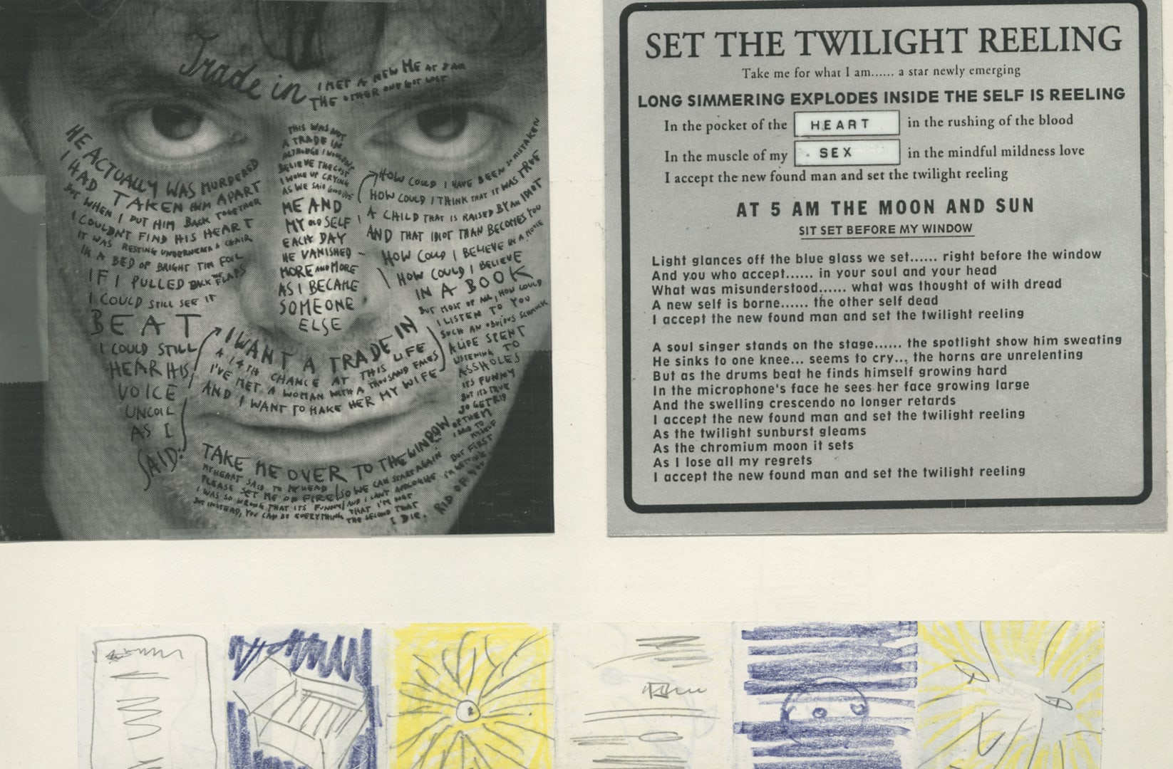
There are so many recurring motifs in your books. So let’s go through a few. You start most sketchbooks with a quote. Generally a newspaper clipping, actually. Why? Does this center your thoughts?
Of course, these were never meant to be shown. I basically made a sketch in my latest sketchbook today, but I’m not self-conscious about it, meaning this is completely for me.
If there’s a newspaper article in it, it’s something I found hilarious, ridiculous, or fantastic. It’s not really a quote that has an importance in my life.
I remember one excerpt you have where a writer suggests throwing out all your annoying CD jewel cases. Which begins a book after you’ve probably drawn 1,000 different layouts for albums you were working on.
Interesting! (laughs)

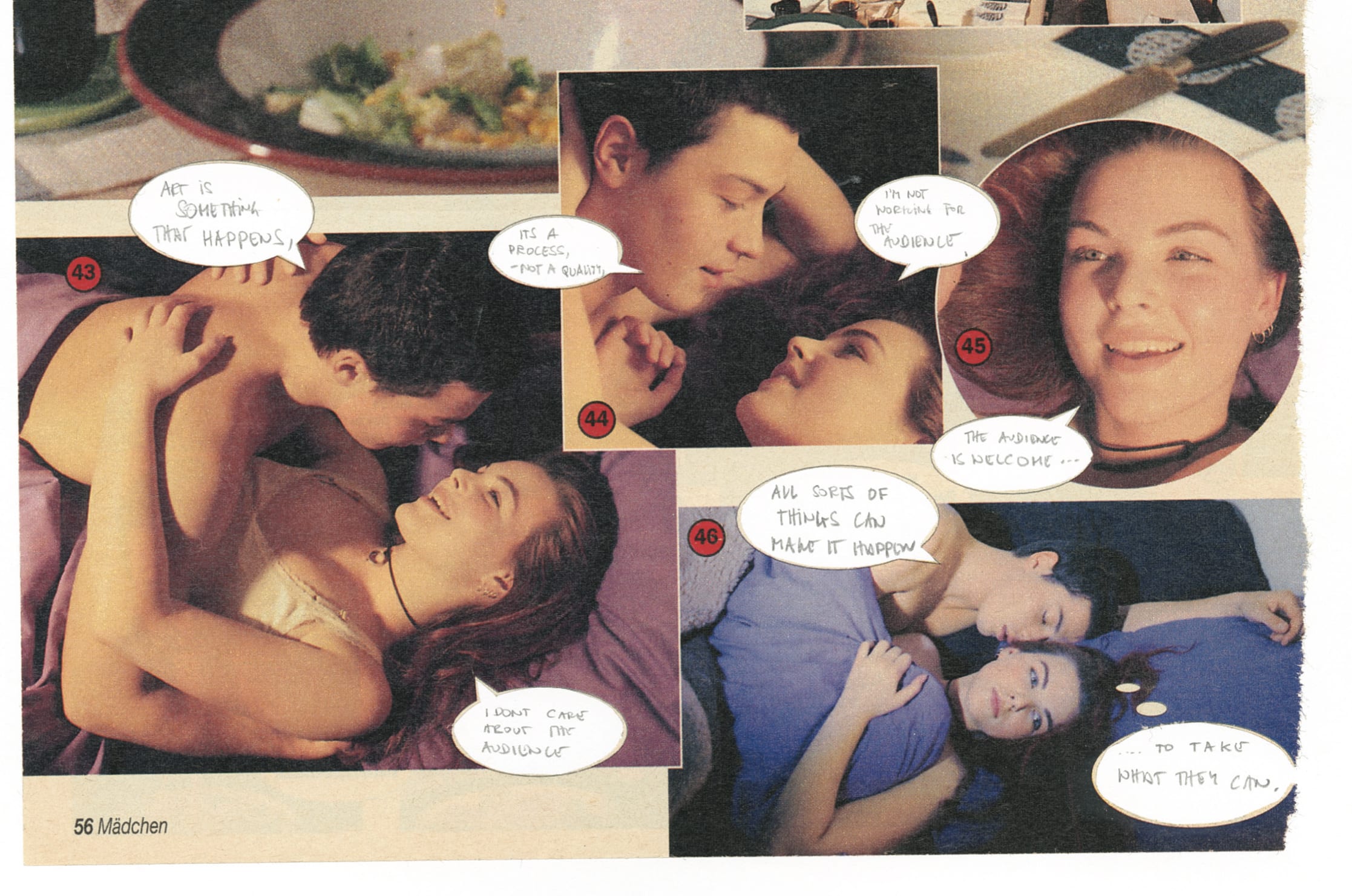
You have this recurring motif where you place speech bubbles over dry stock photography. Making little stories.
We did it for a book for David Byrne, and he just gave me some sort of corporate text. And it’s fantastic to work with David because he’s sort of the ideal collaborator. He gives the direction but then leaves a lot of room for interpretation. If I remember correctly, in this case, he gave me some sort of corporate business-gobbledygook text, and we made seven or 10 spreads out of it using stock photography.
There are other themes to your work that show up in sketches. Dismemberment and sliced appendages is a big one. What drew you to that?
I haven’t used it in many many years, but I think for a long time, I believed it was a strong image. Like, a sliced poodle is pretty on one side and quite cuddly, and when you sliced it, it’s the opposite. So you have this graphic contrast in a single image. And I think in graphics—in general, the profession—you’re always looking for contrasts. In many ways, the work I’m doing now, where I insert some sort of minimal shape (that’s ultimately a data visualization) into 19th century figurative art, also works in that same direction of being very contrasty.
In general, it’s using contrast as means of visual interest—which is ultimately my bread and butter.

Visual contrast or topical contrast?
Both. Contrast is a technique to create visual interest.

How did you use these books? Because while I know you say they weren’t meant to be seen, they do feel curated.
Yes. You are totally right. There’s a whole other class of sketchbooks that’s smaller and much less orderly and have a lot of crap in there. Basically, what you’re seeing here starts when I was at Pratt Institute, which would have been 1986 or ’87. So you’re probably seeing 35 years of sketchbooks.
What you’re looking at here [are] mildly curated sketches. I found that sometimes the good stuff was beneficial for me to save because I could look back or it might trigger something else. That’s probably why they appear relatively orderly.
I might have done a scrappy little sketch in a small sketchbook, which I might cut out for a large sketchbook, or I might resketch it because this is something that might lead to something else in the future. But I always have tons of smaller sketchbooks running [aside from this collection]. I found some of the stuff in these sketchbooks was interesting, but most was just crap. I doodled something down or did some math. Some have nothing but math because I’m figuring out how big a form should be as a percentage for some statistics I’m visualizing.
So these were your references for later? You found value in that?
Here and there, yes. Not necessarily to find ideas for reuse. But much more likely, if I’m working on something totally different, to go back and it might trigger something that would go into a maybe different direction—something that might have had nothing to do with the work I’m working on. There’s also a little history: I left various traces on how I arrived on something, but that’s less important [for me].
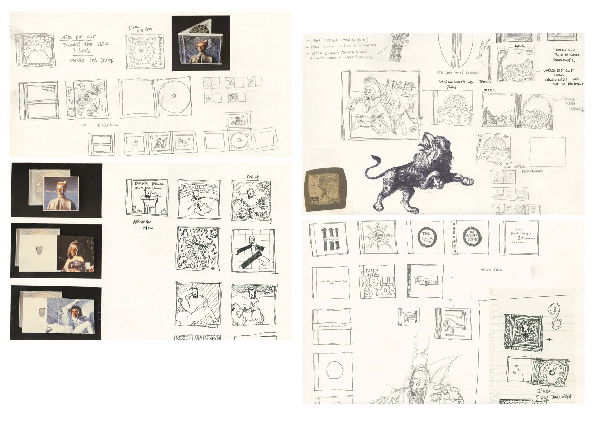
The Rolling Stones’s Bridges to Babylon cover feels so like that—you really see musings become a formalized cover.
It wasn’t created for a viewer. But at the end of the job, I put the stuff that was also coming along, Polaroids of things I would glue as well. I remember the Stones wanted to have me sign a contract where they own all my sketches, and I said that’s not going to be happening because they’re in sketchbooks and I’m not going to give you my sketchbook. And they agreed to it! But then they borrowed one of the sketchbooks for an exhibition, and I almost forgot about it until years later.

I did find myself almost hallucinating visual motifs becoming actualized ideas over the years. I think back to a collection of chairs for two New York Times Magazine covers, then I swear I started to see a chair silhouette pop in now and again before you created your physical Darwin Chair decades later.
The Darwin Chair is an interesting thing. I do believe this did come out of the sketchbook. I might have drawn it 10 years earlier in Indonesia on sabbatical, but only later had the time to have that thing become a real chair as opposed to a sketch in a sketchbook. In this case, it really was something that was a little sketch there and years later, it became an actual chair which was bought by the Philadelphia Museum of Art.

Ultimately, I don’t really put any value on the ideas in the sketchbook. It only has value when it’s done, created, and out in the world. And it happened the other way! I’ve made a sketch in the sketchbook, nothing happens to it, and three years later there is someone else who made it into a real thing. And I’m like, “Fuck I shoulda done it,” but I was too lazy or ignored it.
Somewhere in the books, you’ll see a photoshoot we did for a metal band. It went nowhere. But it was kind of gothic typography with nails hammered through it. And years later, I did a promotional book from a photographer who had the same gothic typefaces with nails and the shadow going in the same direction. There was no way this photographer could have seen the stuff in my sketchbook! But I took a photo and sent it to him and he was just amazed. It was not just the same idea, but the exact same execution!

Part of the fun of these books is just seeing your hand at work. You illustrate objects and totally bespoke typefaces so comfortably. Were you always good at drawing? Did you study?
When I was a child, I was not a particularly good drawer. When I was in grade school, there was a classmate who could draw spaceships and people would give them their lunch for his spaceship drawings. This was not me! I was a very mediocre drawer, even in high school. I came to design through a magazine. At 15, I started to write a bit for a local youth magazine. When the person who did the layout left, I took over the layout and realized I liked it more than the writing.
Through that, I wanted to study design at the University of Applied Arts in Vienna. There was a conservative professor who wouldn’t take any students who couldn’t draw. I failed the entry exam incredibly. But in the year after I failed the entry exam, I basically went to a small design school but forced myself to do nature studies for hours every day. That’s how I learned to draw, and drawing is a learnable skill. I’m sure if you want to draw like David Hockney there’s talent involved, but if you want to draw to be a good [designer], that’s totally learnable. And I can guarantee if you have the desire . . . you’re going to become great. And it’s going to sometimes be frustrating because you have good days and bad days, but if you do it for a year, you’ll be a 100 times better drawer than you are now.

You’d make it into Vienna!
I was [still] not very good. The Vienna realists were a small group of artists who drew these fantastically realistic paintings, and they could draw like crazy, but they were very narrow-minded . . . for me it was unbelievably frustrating to be in a drawing class with these people who could draw unbelievably well. But I was always good enough to show a client what I was thinking, or to basically make a sketch of an idea we’d then realize in photography or much more realistic illustration.
It’s interesting because as a designer, your aesthetic is largely defined by your hand. And that’s stayed true, even as you’ve lived through a transition from analog to digital tools. I’m curious how you’ve managed to work between those two mediums so long.
In the ’80s, when corporate modernism ruled (and even into the aughts), so much of the desire of designers was to make it look like a machine made it. Which always seemed completely ridiculous to me. That seemed like an interesting goal in the 1920s when modernism was invented, and you could say, “Let’s get rid of the 19th century stink and all that ornamentation and bring in the machine age of the industrial revolution,” but by the 1980s this seemed ridiculous.
We wanted everything we could design or create to look like it was made by humans, by a person, and a person is talking to you.
You see this on a completely different level now, at how unpopular anything is that has that AI stink on it. Within months! It was unbelievable to see [that] it went from, “Wow!” to “I can’t stand this shit.” I think that’s very, very much connected to this idea that ultimately we don’t very much like the machine made.

I agree with you, until I look at the greatest Apple products, or even the way photography is super saturated today (because Google will tell you people invariably choose to look at less natural, more contrasty colors). We do desire the imprint of machines!
Absolutely, I’m looking at a super slick lamp right now that would be impossible to blow by hand. And no, I think it’s ultimately probably the mix of the two. I don’t think either one is going to go away, and both of them have their own gorgeousness. I was possibly the very last generation that, when I started studying type in art school, I started completely manually. The first year we painted 10 pt type with a brush, with serifs and things. Not that I’m proud of that at all, but I think it’s the combination where the truth ultimately lies.
And I can see people who grew up with computers not bothering with manual sketches because, if you’re really good digitally, you’re probably not hindered by the tools. I myself am much, much faster figuring something out with a pencil than I would be digitally. Not for everything, but many things.
Example?
Today, in the morning, I sketched an installation—an idea for some future exhibition somewhere. It was very clear I was going to make a sketch with markers and colored pencils because I’d be much faster sketching it than I could do it digitally. But I wouldn’t show this to a gallery or museum. The next step would be we visualize this thing in the studio, make visualization that would involve digital programs to visualize it. Then in this case, we’d ultimately build it in 3D. Because we might make an injection mold from it to create the actual thing.
Injection mold for an installation?
Oh, in this case, I’d want tens of thousands of it.
Talking to designers, it’s clear that AI is becoming the sketch tool of our age. You mentioned the soulessness of AI renders, and I’m really of two minds on this. On one hand, you lose the hand of the person and the mastery behind it. On the other hand, as someone who sucked at drawing for most of his life and walked away from it, I would have felt empowered to realize ideas.
It will definitely affect the work. I have no doubt about it. If you look at the history of design, we always follow tech with new developments. Design is completely influenced by technical innovation. Starting from the stone axe, all the way through the Roman typography with serifs for being part of our tools, to printing to Gutenberg to desktop publishing and digitalization, all the way now to AI. Basically all this technology came and it had a gigantic influence of where design ultimately went. Especially when you’re talking about communication design and product design.
I’m very much, as you are, of two minds. I could probably argue it both ways . . . and people who have a much clearer crystal ball when they look at AI than I do, they are also of two minds. There are experts who think it’s going to be fantastic, a disaster, and in the middle.
I’ve spent the past five years very much looking at the long term, and it’s become clear to me that after any initial time of insecurity, where lots of crap was developed, we tended to use our technology more for better than worse. My usual line is, “With the invention of the hammer more people built their house than killed their neighbor.” Moving forward, that’s my prediction. We’ll ultimately have this time now where we have so many side effects of AI that we will have to first eliminate or find rules against them. As they disturb us. But ultimately more people will use AI for something good than use it for something bad. That would be my guess. Ultimately, I’m positive about it.