Cars need their buttons and knobs back
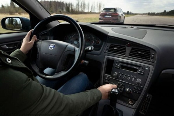
Car touchscreens are harder to use than physical buttons, knobs, and dial controls, according to rigorous testing by the Swedish car magazine Vi Bilägare. It’s but another piece of evidence in a growing pile, in fact, that you have to wonder why we’re still using touchscreens in cars at all. The magazine’s study compared 11 modern cars with touchscreens—from BMW to Mercedes to Nissan to, of course, Tesla—with a 17-year old Volvo V70 that has only physical controls. After a period long enough to learn and be comfortable with each car’s user experience, test pilots had to perform a series of four actions while driving at 68 miles per hour. The first was to activate the heated seat and start the defroster (hey, it’s Sweden). Then they had to power on the radio and set it to Sweden’s Program 1 station. After that they had to reset the trip computer and then “lower the instrument lighting to the lowest level and turn off the center display.” 2005 Volvo V70 [Photo: Glenn Lindberg/Vi Bilägare] The results clearly favor buttons and knobs The magazine then measured the time and distance it took for people to perform all of these tasks in a row. The results, as they point out, were overwhelmingly in favor of the old Volvo: “The easiest car to understand and operate, by a large margin, is the 2005 Volvo V70. The four tasks are handled within 10 seconds flat.” MG Marvel R [Photo: Glenn Lindberg/Vi Bilägare]That anyone managed to do all of those tasks in “10 seconds flat” is by itself pretty impressive, if you ask me. Notably, the expensive cars with the fancy touchscreens loaded with features produced the worst performances. From the 23.5 seconds of the Tesla Model 3 to the terrible 44.9 seconds of the MG Marvel R, these cars did a poor job of keeping the user experience clean and effective. A BMW iX (30.4 seconds) or a Mercedes GLB (20.2 seconds) didn’t do much better. Paradoxically, the touchscreen setups found in the least-expensive vehicles in the testing were actually the most efficient. The Dacia Sandero (13.5 seconds) and Volvo C40 (13.7 seconds) proved nearly twice as fast to operate as many competitors. The difference, according to the author of the study, is that these two cars have the right combination of simple touchscreens and physical controls. Why buttons make more sense than screens Touchscreens aren’t inherently bad in all contexts. Their user interfaces are great for general-purpose devices that can serve many different functions, like phones and tablets. These machines morph into different types of “physical interfaces,” as Jef Raskin proposed with his idea of the “information appliance” back in the ’80s. Raskin was the human-interface expert who led the Macintosh project until Steve Jobs—the only guy whose gigantic ego rivaled Raskin’s—kicked him out. Raskin’s original idea for the “information appliance” was a computing device with a single purpose, so easy to use that anyone would be able to grab it and start playing with it right away, without any training whatsoever. Like a toaster or a microwave, this device would have the right number of buttons in the right position and the right software to perform its task. Later, Raskin realized that his vision was impossible because people couldn’t carry around one perfectly designed information appliance for every single task. So he fell in love with touch interfaces to create a morphing information appliance in which each task—a GPS, an email, a music player, a drawing pad—could have its own virtual buttons. The first true realization of that idea was probably the Apple Newton, but it wasn’t until the first iPhone and its apps that it truly took over the world. You’ll spot a clear parallel between Raskin’s evolution and what has happened with cars. For the longest time, cars were the “specialized appliances” that everyone could figure out intuitively, with the right buttons in the right places. Some tasks were easier than others, but you could learn them in little time. And once you did that, you could almost blindingly control all of its functions using pure muscle memory. At one point, cars started to get a lot more complex, introducing features like GPS screens that also displayed the radio station. It made logical sense to introduce touchscreens to consolidate these new functions, but the results were layers of increasingly intricate interfaces. Before, it only took the twist of a dial to set the temperature of your seat. In a modern car, you have to navigate through menus to get to the right screen in which to find the right virtual set of buttons. It got worse when Tesla introduced the first giant, iPad-like screen in 2012 in its Model X. It allowed Tesla to deliver extensive functionality, according to Elon Musk, and future extension of functionality through software updates. It also likely saved the company money by cutting down on manufacturing challenges, one of Tesla’s biggest problems. Other manufacturers followed suit, further pushed by th
Car touchscreens are harder to use than physical buttons, knobs, and dial controls, according to rigorous testing by the Swedish car magazine Vi Bilägare. It’s but another piece of evidence in a growing pile, in fact, that you have to wonder why we’re still using touchscreens in cars at all.
The magazine’s study compared 11 modern cars with touchscreens—from BMW to Mercedes to Nissan to, of course, Tesla—with a 17-year old Volvo V70 that has only physical controls.
After a period long enough to learn and be comfortable with each car’s user experience, test pilots had to perform a series of four actions while driving at 68 miles per hour. The first was to activate the heated seat and start the defroster (hey, it’s Sweden). Then they had to power on the radio and set it to Sweden’s Program 1 station.
After that they had to reset the trip computer and then “lower the instrument lighting to the lowest level and turn off the center display.”
The results clearly favor buttons and knobs
The magazine then measured the time and distance it took for people to perform all of these tasks in a row. The results, as they point out, were overwhelmingly in favor of the old Volvo: “The easiest car to understand and operate, by a large margin, is the 2005 Volvo V70. The four tasks are handled within 10 seconds flat.”
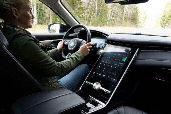
Notably, the expensive cars with the fancy touchscreens loaded with features produced the worst performances. From the 23.5 seconds of the Tesla Model 3 to the terrible 44.9 seconds of the MG Marvel R, these cars did a poor job of keeping the user experience clean and effective. A BMW iX (30.4 seconds) or a Mercedes GLB (20.2 seconds) didn’t do much better.
Paradoxically, the touchscreen setups found in the least-expensive vehicles in the testing were actually the most efficient. The Dacia Sandero (13.5 seconds) and Volvo C40 (13.7 seconds) proved nearly twice as fast to operate as many competitors. The difference, according to the author of the study, is that these two cars have the right combination of simple touchscreens and physical controls.
Why buttons make more sense than screens
Touchscreens aren’t inherently bad in all contexts. Their user interfaces are great for general-purpose devices that can serve many different functions, like phones and tablets. These machines morph into different types of “physical interfaces,” as Jef Raskin proposed with his idea of the “information appliance” back in the ’80s. Raskin was the human-interface expert who led the Macintosh project until Steve Jobs—the only guy whose gigantic ego rivaled Raskin’s—kicked him out.
Raskin’s original idea for the “information appliance” was a computing device with a single purpose, so easy to use that anyone would be able to grab it and start playing with it right away, without any training whatsoever. Like a toaster or a microwave, this device would have the right number of buttons in the right position and the right software to perform its task.
Later, Raskin realized that his vision was impossible because people couldn’t carry around one perfectly designed information appliance for every single task. So he fell in love with touch interfaces to create a morphing information appliance in which each task—a GPS, an email, a music player, a drawing pad—could have its own virtual buttons. The first true realization of that idea was probably the Apple Newton, but it wasn’t until the first iPhone and its apps that it truly took over the world.
You’ll spot a clear parallel between Raskin’s evolution and what has happened with cars. For the longest time, cars were the “specialized appliances” that everyone could figure out intuitively, with the right buttons in the right places. Some tasks were easier than others, but you could learn them in little time. And once you did that, you could almost blindingly control all of its functions using pure muscle memory.
At one point, cars started to get a lot more complex, introducing features like GPS screens that also displayed the radio station. It made logical sense to introduce touchscreens to consolidate these new functions, but the results were layers of increasingly intricate interfaces.
Before, it only took the twist of a dial to set the temperature of your seat. In a modern car, you have to navigate through menus to get to the right screen in which to find the right virtual set of buttons.
It got worse when Tesla introduced the first giant, iPad-like screen in 2012 in its Model X. It allowed Tesla to deliver extensive functionality, according to Elon Musk, and future extension of functionality through software updates. It also likely saved the company money by cutting down on manufacturing challenges, one of Tesla’s biggest problems.
Other manufacturers followed suit, further pushed by the success of smartphones among consumers, and tantalized by the fact that touchscreens are cheaper to build into a dashboard than buttons and knobs.
It’s not news for anyone who is paying attention
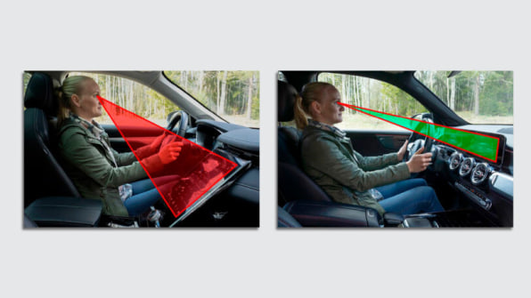
Even if screens appear flashier to consumers, or are less expensive for manufacturers to implement than physical buttons, they come at another cost. The time it takes to perform tasks in a car is not only a nuisance but also, as Amber Case—design expert, research fellow at Mozilla Foundation, and author of Calm Technology—points out, can be distracting and dangerous.
“Because buttons are not fixed to specific locations, screens inhibit muscle memory and findability,” Case says. “Touchscreens compete for attention with the driving process, adding to the dangers of distracted driving.”
Case’s reasoning is something that car enthusiasts fully understand and agree on. The U.S. Navy does, too. It published research from 2019 showing that touchscreen controls are problematic when you are performing critical tasks, like driving.
The Navy made this discovery after introducing more and more touchscreens in its ships, reaching the conclusion that the more stuff you cram into a touchable interface, the more confusing it becomes.
Again, this is a logical conclusion that has been echoed by car testers in publications including Car, Jalopnik, and Road & Track. Why car manufacturers still insist on moving everything to the screen, despite the piling evidence, is beyond me.